
It's not in the can...
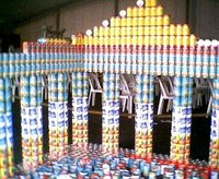 Sandra was the one who took pictures from the architecture week cans. (now on my yahoo pics) And just as we expected, it was nothing extraordinary... I mean, the can constructions are nothing some kids couldn't build with lego bricks... they don't feel like being done by prestigious studios around NZ.
Anyway, I found this children's paper chair (literally)... what a great idea! (via)
The chair encourage people to buy environmental friendly products, intended to make a comment on our use of paper, is shaped as a toilet-roll. As the paper is being used the size of the toilet-roll increases, such the small child sits on a small roll and the older child on a bigger roll!
The Chair is made with drawing paper, as the paper is being “drawn upon”, the size of the front
cylinder increases and thus follows the child’s growth!- age 2-7 Years. Clean paper is transferred from the back cylinder to the front simply by rolling the front cylinder backwards. The amount of paper is approx. 500 meters, which means that the paper can be changed twice a week for 5 years.(In periods the child might draw all the time, in others the chair provides a personal and decorative element in the playroom).
The Chair also comes in a carpet-variation.
posted by Fernando Vallejo at 12:45 am
![]()
![]()


3 Comments:
No wonder you have truobled life...you shouldn't use Photoshop for a catalog layout, that's for shure ヽ(`з´)ノ
I know, I know!!! But I'm just a poor person.
ciao
Beware Will Robinson, Beware!!
If you are making the catalog for the web, you should rely on HTML text and leave Photoshop textes for headings only (HTML text is leaner and easier to edit--and you can justify text--).
If your intentions are to go pro and print the catalog, you should stop right now before you get yourself into a fine mess.
Really, if you try to print anything but a colorjet print, your textes are going to get pixelated and sufer from color ghosting (spooky isn't it?)
Since Photoshop text is rasterized, it will inherit the resolution of your base file, to have clean lines and crisp text you'll need to crank up the resolution to at least 1200 dpi. thus making your files über heavy.
Color ghosting is easier to solve, just be shure to work in CMYK mode and use only 100% black for your text, ergo avoid use color in textes below 12 pts (14 is safer).
I know it looks like I'm always putting you against the wall but... hey what are friends for ^_^
Let me know howizit going, Ok mate?
Cheers to Fraü Sandra ^_^
Post a Comment
<< Home