Friday, May 30, 2008

Cusp Conference 2008

cusp 08
Cusp Conference 2008 - sponsored by Graphis - a conference about vision, passion, imagination, energy, innovation, and the "design of everything." Taking place at Chicago's Museum of Contemporary Art Theater on September 10 and 11, 2008, Cusp will offer two days of remarkable ideas, inspiring stories, and mind-expanding conversations with an eclectic group of thinkers, innovators, skeptics, believers, visionaries and explorers from the arts, sciences, technology, business, design and government.

17+ presenters will share their passions and stories - and help you create new ones.

Presenters to date include architect/artist Adam Kalkin, digital pioneer/filmmaker Douglas Gayeton, poverty fighter Paul Polak, eco-scientist Dr. Carl Hodges, musician/digital artist Kirsty Hawkshaw, and environmental attorney Robert F Kennedy Jr.

Seating is extremely limited, so I encourage you to take advantage of what promises to be a stimulating and rewarding experience. Conference details and online registration information can be found at www.cuspconference.com.

Cusp Conference 2008 is for anyone who believes that design is a good idea.
ciao
Bookmark and Share

Thursday, May 29, 2008

Tastin' good

The following excerpts are taken from a series of posts written by Laurie Fendrich for the Chronicle of Higher Education blog, regarding aesthetic taste. I found her articles quite interesting and I also share her views on this delicate matter. I'm quoting here several paragraphs just to give you a good idea of the content of each article on this series. Hope I'm not breaching any rule by quoting too much, but I strongly suggest that you visit her blog to read the whole articles.

About the Author:

Laurie Fendrich, a painter who lives and works in New York, is a professor of fine arts and the director of the Comparative Arts and Culture Graduate Program at Hofstra University. Her writing has focused on the place of art and artists in society and the education of young artists, but she has also written essays questioning the viability of beauty in a post-Darwin era, the meaning of abstract painting, and the tyranny of outcomes assessment. She blogs about university life, the arts. and culture.


The aesthetic taste of college students derives from what their homes look like and their high school experience. High-school taste fuses together the sights of the mall, TV, the movies, and the Internet. No matter their socio-economic background, gender, ethnicity, or race, without active intervention on the part of college teachers or enlightened peers, it’s unlikely that students will change their taste during college.

But it’s not just college students who often have narrow or bad taste (these differ, I admit, but they frequently overlap). I’ve known many powerhouse intellectuals, academics, bankers, doctors, and lawyers whose taste was execrable, or just plain ordinary, or who were completely oblivious to taste.


Ah, that nasty word elitism. But like Jon Stewart said, in mocking the flurry of commentators who charged Barack Obama with “elitism” : - don’t we want leaders in democracies who are “better than us”? - When it comes to art, the questions really are, Why are college art professors so afraid to convey to their students that they have superior taste?, and, Why are they afraid to teach that taste to their students?


Aesthetic taste, in reflecting the sensitivities peculiar to the organ of sight—the eye (working in conjunction with the brain, obviously, since the eye is passive)—derives from a number of things, beginning (although by no means ending) with the biology of the viewer possessing the taste.

It should be obvious (although somehow it isn’t) that having good or bad taste—in anything—has utterly no connection to whether one is morally good or bad, and startlingly less correspondence with intelligence or level of education than one might think. Life mixes morals, intelligence, education and taste in individuals into various stews. Aesthetic taste changes drastically from culture to culture (some cultures, for instance, like lots of clutter, while other cultures like things visually sparse), which makes cross-cultural comparisons risky. And within individuals, it changes as they mature. In their twenties, thirties and forties, people’s tastes often change rapidly and frequently. By fifty, however, most people’s tastes are usually pretty much set in stone.

In his absolutely essential essay, “Of the Standard of Taste” (1757), David Hume acknowledges that the several qualities someone with good taste must have—“a strong sense, united to delicate sentiment, improved by practice, perfected by comparison and cleared of all prejudice” —are impossible to identify in any given person.


Children neither see nor think about the taste in their homes, which are simply backdrops to their lives, not aesthetic zones. Whatever taste is expressed in the home is simply the way things are — like the forces of nature — and it’s almost impossible for children to step back and think about their parents’ taste.

Good taste requires, for starters, that the whole prevail over the parts. Few of us have either the money or the aesthetic focus to construct our interiors following this principle. Instead, most of us acquire our aesthetic objects — i.e., those things in plain view in our homes that we like to look at — rather serendipitously, over time, the same way my parents did. Good taste necessitates a certain mercilessness — a cool determination to cull sentimentally valued individual objects out of the herd of one’s visible possessions for the sake of the aesthetic whole.

We lost something when we permitted the intellectual elite to knock bourgeois culture down so that masscult could then trample it to death.


She told me that she thinks that people getting so worked up about taste is something that could only happen in a democracy. She says that Tocqueville’s book is about how people in a democracy love equality more than anything else. Even though they say they love freedom, when push comes to shove, they’ll take equality over freedom any day.

I think this is still true today. The mere thought that some people might have better taste than other people seems to make a lot of people go bonkers. (It’s funny, though, how they accept the fact that some people are just plain better at sports than other people, or that some people have better singing voices than others do. Even if you’re born with sports talent or musical ability, you have to work hard to improve them, and people accept that. But they don’t like the idea that the same things might apply to taste.)


Students arrive at college assuming, much like everybody else, that taste is simply a natural expression of personality, and that it’s subjective and not worth arguing about. (“De gustibus non est disputandum,” as those who know their Latin like to say.) Good taste requires that a lot of things come together — a brain that is capable of acute visual discrimination, a broad range of experience in looking at visual things (coupled with a concentration in looking at the best visual things), thinking about what objects look like, abstracted from their utility, having an open mind when encountering new visual stimuli, possessing a willingness to weigh the relative visual merits of the objects we look at, and — it should be unnecessary to add, but it’s important — being in a generally sound mental and physical state when looking, thinking, and weighing.

When I make a critical comment about a compositional or color problem in a painting-in-progress by a beginning student, it’s not uncommon for that student to say, “But I wanted it that way.” A student’s defending a work by retreating into radical subjectivity (i.e., intention is all that counts, and all intentions are immune from judgment) is an understandable emotional reaction. It takes time for a student to learn to separate his or personality from its accompanying taste. If students keep up that kind of defensive attitude (a few do — but most have at least an inkling that it obviates the whole point of taking a painting class), they’ll never progress much.

enjoy
Bookmark and Share

Batsiranai

batsiranaiWe went window-shopping last friday and found one of those "mall islands" with handcrafted items from Africa. They had a 50% discount on everything, so of course I ended up with another mask for my collection. It's just terrible for the pocket when there are so many nice things in one store. While we waited for the cashier lady to attend other customer, we grabbed more items... and even as she was wrapping our things we bought a set of earrings. Those earrings are particularly interesting, they are made out of old fashioned tin bottle caps ... nowadays most bottles come with those horrible "taparoscas" (plastic caps).

I remember when "corcholatas" actually had a cork ring inside. It was a challenge to get the ring out of the cap, but the reward for a bit of patience was a nice item to play with. I don't think the new plastic caps have the same hypnotizing effect on children anymore. I also remember that sometimes they had pictures for collecting. Like for example pictures of the national Mexican soccer ball team, which you could glue into a cardboard and exchange with your classmates. Of course there's always the one that is hard to get, and you would trade it for a lot of the common ones. A collection like that should cost a lot more than a few bottle caps nowadays. I just found a 2005 coca-cola bottle, not a special edition or anything... and it's worth 100 pesos!!! I will definitely call the insurance company first thing in the morning to get an appraisal of my bottles collection... specially those with the 1950's pepsi logo that resembled the coca cola logo.

Anyway, back to the earrings, they are part of a project called "Batsiranai" which means "helping each other":
batsiranaiBatsiranai (BAT-si-RA-nai) is a women’s handicraft project that supports mothers with severely disabled children living under challenging circumstances in Harare, Zimbabwe. In addition to living with extreme poverty, these families often suffer from stigma related to local beliefs regarding the origin of disabilities. In addition to stigmatization, 25% of the Zimbabwean population is living positively with HIV. Thus, in Zimbabwe there is much opportunity for “helping each other.”
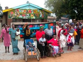
The mother's group initiative has been so successful, that it inspired a group of fathers to start a similar venture:
The ‘fathers group’ began meeting in December 2004. In the group’s first meetings, the men were interested in how they might reduce the stigma surrounding people living with disabilities. Disabilities are poorly understood in Zimbabwe, and it is not uncommon for a father to abandon his wife and newborn child when the child has a disability -- blaming either the wife or voodoo for this 'defect.' This 'shameful' view of disabilities is often shared by extended family and the surrounding community.
batsiranai - hand painted earrings
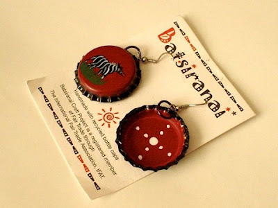
Those earrings are a beautiful product on so many levels. Of course the hand painting and design is superb. What I personally like the most is the noise they make, it sounds... well, like bottle caps! That brings back memories of the times when we played with those things. I guess our perception of simple feelings and sounds gets spoiled with modern life... that's why so many people set their digital cameras to make the noise of mechanic cameras, some people enable their computer keyboards to make the noise of a typewriter, etc. The transformation of a discarded object into a piece of jewelery is fantastic. And the fact that a community is doing all that to get better opportunities for their disabled children, just closes the full circle. batsiranaiHow can we be so obsessed and distracted with gadgets, celebutantes and infotainment when there are many simple things that are so powerful? Why are so many blogs reporting on the latest coolhunting gizmo? which is just empowering big electronic corporations, whilst so few talk about projects which empower actual people: congratulations to Mai Paul, Mai Munashe, Baba Mutsa, Baba Sipaphile, Baba Precious and all those mothers and fathers (and of course George too) for their stupendous job, and best of luck!

ciao
Bookmark and Share

Friday, May 23, 2008

Where everyone gets a spook

We've been bombarded this week with TV advertisements from the warehouse republic revolution @ the warehouse( ...or should I say spookhouse?) announcing that they teamed up with kiwi (interior) designers Peter Reid and Graham Dickie, to launch what they call "design for everyone". Under the name "republic revolution" the warehouse is now selling products hand picked by the founders of "republic home stores", which are supposedly labeled as "designer" products, when in fact, they are just the same junk and kitsch, only in more neutral colours so they can be "easy for you to coordinate with confidence". I mean, would you actually trust the good taste of someone that shows a moose head as decoration on their interior design website? and don't let me get started on that pewter cross!

Strictly from a business point of view, republic home storesit might be a good business profitable idea (for them). It's true that many people can not afford (some) good designed products. However, not everything that is expensive is actually good design... specially when we talk about furniture. A few weeks back we went to Parnell to have dinner with some friends, when we were walking to our cars, we discussed how expensive are most of the decoration and furniture sold at the stores in that area. Then again, I insist that not because it is expensive, it means it's not kitschig sometimes... in some of those stores (like republic home): it's just expensive kitsch most of the time.
I don't see anything about good design being expensive... do you? If good design is not expensive "per se", then why are some "designer" products sooooo expensive? That's because it's "emotional design" which is different from "good design". bodyfurnEmotional design is expensive. In fact, that the main characteristic of emotional design, to generate a desire to have the product so strong, that people will pay anything to have it. Emotional design has to rely on some characteristics of good design in order to be attractive, but when there are considerations that would make the product unprofitable, like strong technical contradictions, those considerations will be left unsolved. For example, apple chooses to forget about any environmental consideration, and yet people find their products desirable because they do very good work on the remaining 9 principles. Other emotional products focus only on 5 or 6 of these principles... so why do we call them "good design" when they would get a C- or perhaps even a D if we grade them against this principles? I wrote about furnware's bodyfurn chairs a while ago, as a case of bad design being marketed as "good design" just because they solve only one ergonomics problem, and nobody cares that they leave out all other design considerations... like solving those terrible horrible legs! Their marketing strategy: emotional design. I'll discuss about Dieter Rams and apple on a later post... and maybe expand on emotional design.

Good design exists not only design republic - the warehousewithin the highest price ranges. In fact, it resides not at the top level, but mostly immediately below diva, vedette, posh and that kind of emotional design which is the most expensive and not necessarily good. So it's true, affordable good design does exist. However, it is not called good design because it's "stylish" or "minimalistic". It is good design, when ALL aspects like ergonomics, manufacturability, technique, sustainability, use, packaging, repairs, etc, etc are considered and solved in an innovative and coherent way (consequent to the last detail). Aesthetics is just one of those aspects, is not the main quality, and specially no the only one. Good design is certainly not about colour schemes or "styles that combine", or minimalistic decoration that "is hot" or "cold" or with "strong forms" or "refreshingly different"... if you want something hot, then go to McDonalds or McCafe not to the warehouse!

ciao
Bookmark and Share

Wednesday, May 21, 2008

HabitatExpo

habitatExpoTomorrow starts HabitatExpo in Mexico city. There are several interesting conferences (not just for architects), specially the main presentation with Enrique Norten, Víctor Legorreta, Javier Sordo Madaleno and Teodoro González de León. More info : http://www.habitatexpo.com/

ciao
Bookmark and Share

Tuesday, May 20, 2008

Olympic spirit

Sorry, I had the idea for this post laying around for a while... NZ olympic team Jandals uniformin fact, I have lots of stuff on my "to do blog" list. I try to catch up one by one. A couple of weeks ago, the NZ olympic committee presented the new uniforms for the NZ players. After last time's scandal that the uniforms were designed and manufactured overseas, this time they decided to have an "all kiwi made" uniform. One thing they didn't count on, is that (probably) there are no shoe manufacturers here... at least that's what I guess... Oh wait! there are those "comfy shoes" but they are too expensive... at least more expensive than "crocs".

"Crocs came to us with a generous [sponsorship] package, and there really are no New Zealand shoemakers of note left. So we seized the opportunity and I think they look quite smart." said New Zealand Olympic chef de mission Dave Currie.

jandalsAnyway, the NZOC decided to use one of the "kiwi icons" a.k.a. "Kiwiana" for this game's uniforms : Jandals. Which are a kind of sandals, that many kiwis regard as a local invention. Morris Yock patented the plastic version... however the myth over who was the Jandal's inventor has been recently challenged, and alleged that Yock was merely importing those sandals from Asia and marketing them as made in NZ. Funny that the manufacturer in Hong Kong was also a kiwi!

In a country obsessed with sports, reaching quasi redneck levels, sports teams are already using the silver fern and the black colour, so they are monopolizing (almost) every kiwi icon there is! The question is if in a desperate search, the social construction of identity is adopting those icons associated with sports, or athletes are using those icons because they were constructed first by society. I can only guess that the athletes will be getting free vegemite, watties, hockey pokey, fish and chips and L&P as part of their diet, in which case, it doesn't get more kiwi than that.

I just can't understand why they are using NZ medal winning athletes to promote "tex-mex" junk food ? are kiwis now adopting texan icons to please "the president"? They certainly must have learned that from the politically incorrect and disrespectful "speedy Gonzalez". American media has always shown how little respect to, and knowledge they have about their neighbors. One of such olympic size mockeries was when they played a flamenco song during the mexican team parade at the Los Angeles USA games. It would be like playing Rule Brittania when american athletes are marching... or like presenting the kiwi sports teams using a theme from Kylie Minogue. So when the twins respond "Olé" when they say "mexican style" it hurts me the same as it hurts kiwis when Aussies say they invented the pavlova.

ciao
Bookmark and Share

Sunday, May 18, 2008

On the other hand...

Yes, there are a few socially responsible young designers. Nadia Plesner is one brave example. In her words:
Nadia Plesner's Simple Living"My illustration Simple Living is an idea inspired by the medias constant cover of completely meaningless things. My thought was: Since doing nothing but wearing designerbags and small ugly dogs apparently is enough to get you on a magazine cover, maybe it is worth a try for people who actually deserves and needs attention. When we’re presented with the same images in the media over and over again, we might start to believe that they’re important. As I was reading the book "Not on Our Watch: The Mission to End Genocide in Darfur and Beyond" by Don Cheadle and John Prendergast last summer, I felt horrified by the fact that even with the genocide and other ongoing atrocities in Darfur, Paris Hilton was the one getting all the attention. Is it possible that show business have outruled common sense? If you can’t beat them, join them. This is why I have chosen to mix the cruel reality with showbiz elements in my drawing."
100% of the profits from the Simple Living t-shirt and poster are donated to Divest for Darfur which is an initiative to encourage investment firms, especially JP Morgan, Franklin Templeton, Fidelity Investments, Capital Group (American Funds), and Vanguard, to withdraw investments from companies that help fund genocide in Darfur. Millions of investors are unaware that their savings are invested in companies that help fund genocide in Darfur.

iDon't careThis raised a copyright lawsuit from Louis Vuitton... and probably another will follow from Sandra's cousin. The main problem, as counterfeitchick points out is "that the presence of LV trademarks on the t-shirt could mistakenly be read to imply that Louis Vuitton had made investments that were helping to fund genocide - not a message that the company would want broadcast, even in error". However, this is not the first time that an artist uses a logo or a company for a political commentary... or a t-shirt. Christian groups have been using mock up logos for a long time... Jesus Christ and "come-caca" t-shirts exist since I was a kid, and I don't think that coca cola would actually try to sue them all! Check out my "iDon't care" version of Nadia's image, hope I don't get sued by Steve Jobs for that.

Zbigniew Libera's LEGO concentration campNadia's example of Zbigniew Libera and his LEGO concentration camps on her response to LV is a very obscure quote, but is in deed a quite similar message regarding how unaware or misinformed we can be regarding human tragedy (in this case genocide). Libera's Lego work is part of a series titled "Correcting Devices" meant to illustrate the gap between the ideal world marketed to children compared to the harsh reality which is the real world. lego6741Seems like they are both right on how we are being brainwashed by mass media, and we are more aware of meaningless "american idols", celebutantes, and top models, than our awareness regarding real problems like famine, genocide, etc. Just a couple of weeks ago we watched some newscasts about the farm killings genocide (plaasmoorde) in South Africa something that the rest of the world is also (mostly) unaware (warning: very disturbing images on those videos). My point is, that I must agree with Nadia and Zbigniew, mass media, consumption ("gadgetitis") and propaganda are misleading us into a society that looks away from real problems. Nice to know that at least a few people are doing something to change that.

ciao
Bookmark and Share

Thursday, May 15, 2008

Mentally challenged

In Mexico we say "the one that holds the leg, sins just like the one who kills the cow". I don't know if it's the designer's fault (alone), or company managers' irresponsibility when they authorize (or actually ask) R&D departments to develop certain products... or both. I don't know if it's a matter of professional and civil ethics to decline to work on certain projects. I admired a friend's decision to stop working for a company, when they got a military contract. I guess all those "sustainability workshops" are not making any effect at all, when it comes to the almighty business/profit driven design.

Social entrepreneurship is still just a myth, something that has great risks (you can tell me that)... and is not a real curricular subject at schools... bicicleto o bicicleta?it's just something fun to do on a workshop or a small project designing things with supposedly recycled materials. A few days ago a friend told me that if you give students the choice, they will all line up to design a cell phone, an iPod or a car... and maybe just only one in thousands would sign up for a project involving social causes. And when they do sign up, you may get sometimes someone like the student that made me give up all my hopes about teaching when he said: "why do we have to work this hard and do things right, when those (poor) people are going to be glad with any crap we make for them anyway". Sorry, I lost my train of ideas... but it's going to be one year since that shameful day, and I am still haunted by those words.

Anyway, you know I believe that cars and cars manufacturers are humanity's worse nightmare. I'll post more about the problems with the so called "bio-fuel" later... meanwhile, just ponder how the present world food crisis, was caused by bio-fuel refineries' demand of grains and crops at a higher price than the price set (specially) in developing countries i.e. if you can sell a tonne of rice for more than $1,000 dollars for biofuel, why would you sell it at half that price (or less) to Guinea, Egypt, Morocco, Uzbekistan, Yemen, Burkina Faso, Mauritania, Niger, Uzbekistan, Senegal, Haiti, Bolivia, Indonesia, Vietnam, Cambodia, Egypt, India, the Philippines or Thailand even if it's staple food ? Never mind the riots or people going hungry... or falling into extreme poverty.


With that panorama, why would a car manufacturer launch a new "retro" V8 car? Is it arrogance, stupidity or just business as usual? Arrogance, because nothing can make a better statement that you don't give a *** about others, or the environment as a very big and brand new V8. Stupidity, because... at least for me, there's no better way of describing that attitude. And business, because... that's the whole rationale behind press releases and articles about the retro- Dodge Challenger:
"Before Chrysler can get to the business of building greener cars -- and on this score it's the most backward of all the auto companies -- it has to stay in business. Chrysler could never make a dime off the Challenger program and happily write it off as a marketing expense. The relative handful of geezers who buy this car will not be fretting fuel economy, the price of gas or the perspiration of polar bears. The car is aimed like a Hellfire missile at the emotional groins of boomers who have loads of cash and empty nests. They just won't care about other considerations. The car will sell like mad for a year or two and then fall off a cliff. That will make it relatively rare, enough to give it the cachet of a collector's item. As for these cars' environmental irresponsibility, sure, some, but it will be largely symbolic and notional. Sold in relatively low numbers and left to slumber in garages for most of their lives, these neo-pony cars' greenhouse impact will be a rounding error compared to the giant fleets of right-sized commuter cars like the Saturn Aura or the Honda Accord." (abridged from LAT)
Shame on you mates.

ciao
Bookmark and Share

Monday, May 12, 2008

Eating disorders

When I was in jurassic-school, I just hated when I had to ask someone for a pencil or pen, and they offered me a pencil that was all chewed! Yuck!!!... It's disgusting. Pencils with no eraser left had always bite marks so that the small bit of eraser trapped inside could come out. That just didn't (and still doesn't) make any sense to me: Why people have pencils with no eraser, when they carry a separate normal eraser gum anyway? It's a similar mistery as why car manufacturers still put turning lights on automobiles, when (almost) nobody uses them. Anyway, for those who carry around an eraser, but still like to bite on pens and pencils (or their nails) here are a couple of ideas for your cravings:

Din-ink, designed by andrea cingoli + paolo emilio bellisario + cristian cellini + francesca fontana from Italy, was one of the three winners of designboom's competition "dining in 2015":
"Turn your favourite office tool from your desk in a common cutlery...this is din-ink. A set of pen caps, including a fork-cap, a knife-cap and a spoon-cap, that replaces the normal pen cap during lunch time! All caps are made by annually renewable resources, like natural starch and fibres, to be 100% biodegradable and atoxic, warranting the best alimentary use. Dispensing each set in a compostable packaging the whole set is designed to respect the environment. Now give your office ballpoint pen a good excuse to be gnawed by your teeth: use them for din-ink." (via)
At the time when I was studying in Germany, those edible plates started to appear. So, the traditional Imbiss "pommes" were served on those biodegradable plates. One day I decided to take a bite out of one... I almost fainted! They taste horrible! Those plates look like ice-cream cones, but they're not the same stuff. Anyway, I think it's a great material, and we should probably be looking into more ways of using that kind of material in more applications for food handling, storage, packaging and serving. Anyway... not from the land of chocolate but from the land of Takoyaki comes this delicious chocolate pencils set by Nendo. Instead of graphite hardness grades, it's the cocoa blend what makes the different colours on each pencil.
Chocolate-pencils is a collaboration with patissier Tsujiguchi Hironobu, the mastermind behind popular dessert shops like Mont St. Claire and Le Chocolat de H. Tsujiguchi created a new dessert based on his impression of nendo after conversations with us, and we designed new tableware for them. We wanted our plates to show off the beauty of meals and desserts like a painting on a canvas. Based on this idea, our "chocolate pencils" come in a number of cocoa blends that vary in intensity, and chocophiles can use the special "pencil sharpener" that comes with our plate to grate chocolate onto their dessert. Pencil filings are usually the unwanted remains of sharpening a pencil, but in this case, they're the star! (almost via)
Just don't carry them on the front pocket of your shirt.

ciao
Bookmark and Share

Wednesday, May 07, 2008

Deuteranomaly Ao Harmonics

How do we know that what we perceive as blue is actually blue? What if it's green like aoshingo? Could it be that people in Japan are all colour blind? (or crazy?) Maybe they are just too complicated? When I was a kid, I had the idea (probably I heard that somewhere) that people "like" different colours because we all "see" different colours. Now I know that this would mean there could only be just one favourite colour for everyone.

Anyway, if you'd like to test your colour recognition abilities you can try the absolutely useless game aka designer's test, to associate colours with their #RGB value. To be honest... I only score 3 or 4 points on the easiest level. Or you can try harmonic 313 web site, where you have to discover the words. Each letter has a specific colour. When you solve all levels you are rewarded with a free mp3 download. Not bad for an interactive promotional site... the song is not as good as the game, but it's nice.

ciao
Bookmark and Share

Saturday, May 03, 2008

Paper Fractals

orchid chairOf course Platonic geometry will always be an endless source of inspiration. To be honest, I prefer objects with simple geometric forms that are well balanced and developed from simple grids. The problem is that we normally use 2D grids only to extrude 3D objects. I mean, our mental process for developing a volume is very similar to how volumes are created using CAD. That's how our minds have been trained since we were kids. For many years during pre-school and primary school, kids spend more time with crayolas, making 2D drawings that their parents put on their refrigerators, rather than making 3D objects with meccano or building blocks. I guess it's because there's no way of hanging those things on fridge's doors!

So, our mind will start thinking 2D, instead of shifting to 3D mode when we start an idea. It's not after many years of re-programming our brains to think in three dimensions, that we can actually "build" our ideas in 3D. But still, ... trying to find and develop full geometric 3D grids in our minds is something for aliens from outer space. Imagine you are sketching something on paper in isometric view (as it should always be done)... usually, if we try to apply a simple geometric pattern, let's say a 2 way curved surface, we will draw it in paper just like we would do it on a computer: we'll draw both curves on the corresponding planes and then just drag the points to make our 2 directional curvature. I bet there's only a few people who can actually imagine and fully master a geometric 3D grid mentally. That's why CAD has become a quite interesting tool. CAD programs that work in 3D mode allow us to explore directly on a 3D object without being concerned on how the geometry behaves on a 2 dimensional level.

phillip grassYes, CAD is a very powerful augmentative tool for designers, but not everyone actually takes advantage of that. Most of what we see in industrial design is once again a case of "designer's dogs bollocks syndrome" i.e. most of the shapes and forms we see in objects are geometries created just by adding tools and "filters"... not many are actually created by a deliberate act of design. Parts are organized by tools such as "distribute equally" instead of actually being on a certain place determined by a pre-determined geometrical grid. On the other hand, the traditional methods for exploring origami spoon2 and 3 dimensions are not so simple, only a few can transform a 2D surface into a clever designed 3D object, like this origami spoon by Michael Sholks... and this kind of skill requires a very hard mind training, we just think that computers are easy to use, and any dummy can create a 3D object given a simple software training... well, that's wrong. Yes, any monkey can type into a keyboard or a typing machine and some letters will eventually appear... but that doesn't make the monkey a Shakespeare... a Pulitzer prize maybe.

Anyway... maybe we still have to learn the thinking skills necessary to take full advantage of technologies such as CAD. We'll have to teach kids how to think in 3 or 4 dimensions (yes, including time as a dimension in a product / object life span) before their minds get stuck in a 2 dimensional universe of extruded objects. Maybe teaching them fractal mathematics in highschool could result in more interesting patterns of thinking than the usual algebra or trigonometry. Take for example these fractal sculptures and objects by Richard Sweeney.


ciao
Bookmark and Share