Wednesday, February 28, 2007

Road Show

Next week, we will participate at "Show Your Ability '07" Roadshow Expo. We'll have a stand with Special Kiwis' products samples at the show on Tue 6th March at the Trusts Stadium, Waitakere. SYA is an expo/travelling roadshow with over 35 diferrent suppliers of disability equipment. The Show includes all categories of paediatric, adult and older persons care equipment.

Trusts Stadium
65 Central Park Drive
Henderson
Waitakere City

9 am to 3 pm
Free entry!
We are looking forward for your visit.

ciao
Bookmark and Share

Tuesday, February 27, 2007

1 Bad taco design

OK. This will be a series of examples of bad designs. Today, I am going to start with... tacos. Not the real mexican tacos (which are really good!) no, no... I am talking about the Tex-Mex or american version of tacos, in form of those terrible hard shells.

taco shellThis weekend we celebrated Sandra's birthday, and organized a picnic with some friends. Sandra bought a box of those shells to make "tostadas de pollo", we even bought real refried beans from Mexico and salsa Herdez. The taste of those shells alone was awful, they tasted like recycled cardboard! We had to cut them in half to make half tostadas... because it is impossible to use them as they are... those shells are really a very bad tex-mex invention.

I am totally disgusted with a TV commercial for "old el paso" (I knew, it had to be again by "my friends" from Saatchi & Saatchi). The voice off says something like: "for centuries, Mexicans have been trying to solve the problem of keeping tortillas standing" while on video, there's a guy hammering some nails to a table, and building devices to keep those horrible taco shells standing... Then a kid says: "Why don't you use a flat bottom" and the voice off says: "introducing Old el Paso stand 'n stuff tacos, with a flat bottom" or something like that.


Well, first of all... so called "taco shells" are not a mexican invention... they don't even exist in Mexico! Hard (toasted) tortillas are actually called "tostadas" not tacos, and they are flat! It's not the mexicans' fault that some Texan came out with the idea of making them like hard shells, so don't blame the mexicans for those horrible things. Like the Germans would say: Selberschuld! (That is your own fault!) So, it is false or misleading advertising for a product that is not even mexican at all. Shame on you Betty Crocker! By the way... in Mexico we use real meat, some may joke that it might be dog's meat, but... putting mince or salad, never, ever !!! Then again, when they say "Mexican Style" it is a false statment, and they shouldn't be using that as a slogan.

Anyway, of course those taco shells are terrible from a usability point of view. They are a bad design idea. On the other hand, the real tortillas or tostadas used in Mexico, have been around for centuries, and no one complains or is so stupid not to be able to put the filling on it. Many years ago there was a TV commercial in Mexico that said "There are millions of ways and styles to eat a taco, as there are millions of mexicans with their own "technique", but they all agree on Maseca" The images were refering to techiques like: "the pinky clamp", inclining your head to eat the taco sideways, and many other techniques. The most amazing I've seen, is to put 5 or 6 tortillas in spiral, to form like soup plate. It is said that this was the aztecs's technique.

We always remember a Mexican restaurant in Helsinki... they asked us if we wanted flour or corn tortillas for our "carne asada"! That was amazing! By the way, some friends told us that one of the owners of that restaurant is a member of Leningrad Cowboys, who are happy being misserable. Congrats for being culturally sensitive.

ciao
Bookmark and Share

Friday, February 23, 2007

REDiseño

REDiseñoLast monday the second issue of Revista REDiseño was presented at ITESM campus Guadalajara. There's an online version of the magazine with quite interesting articles. The odd or funny thing about that, is that there are 3 main sections: Design, Lifestyles and Sexuality... just so that designers can say, they read it for the "articles"... or they are looking for new "gadgets" trends.

ciao
Bookmark and Share

Friday, February 16, 2007

Coconut uniform in a Harley Davidson fridge

It was long time ago... one of those school workshops in which we had to work on a project with a team of architects, graphic designers, interior designers and us, industrial design from all semesters. The subject was an emergency shelter for disasters like earthquakes, etc... We came up with the idea of making prefab panels using coconut fibers, instead of fiberglass on polyester resin. Anyway, we designed those panels and the architects used them to build a refugee camp. I remember very well the observations of the architect's professor advisor, she said that it was a good idea to build the shelter houses in a way that they could be "customised" by the inhabitants. That is, because the panels worked just like trade show displays (they even had aluminium pole connectors) they could be arranged in many forms. We also let some of the finishing details open to the taste of the families moving into those refugee houses.

Britney Spears VideoOther customizable items are school uniforms. Well, the school authorities may disagree but some people really don't like the idea of being "uniformized". I remember the ugly green girls uniform at Autonoma's highschool... some girls slowly transformed their skirts into miniskirts. Someone told me once that she used pins, just in case the principal caught her, she would just let go of the pins, and the skirt was back to normal length. Or, you can also customize your haircut... while some people use terrible "tupees" some just cut it bald and put on some tatoos! Thing is, you "have" to customize your look.

I don't remember the name of the movie, in fact there are many movies that make reference to those "uniformed" american house developments (like scissorhands) where all houses are cloned, up to the last detail. Anyway, this movie was about someone that wanted to change the plain white mailbox with the red flag, for a very kitschig mailbox... I don't know, one in shape of a cow or something... and it started a revolution of "customizing" around the neighborhood.

Giving the user the possibility of customizing is a very good design principle. Harley Davidson makes a lot of money on "original customizable parts" they even have a big cataloge. Another example: some of us prefer to keep our cars as original as possible. I don't even let the mechanic put spark plugs that are not the same brand as the original ones... while some people love to change the alloy wheels, put some plush on the dashboard, change the tyres for tractor or slim wheels, etc, etc. It's funny or remarkable how we all tend to customize, or not, the things we appreciate or give value to. I mean, we appreciate/love our car, therefore we decide to customize it... or keep it in perfectly the original state. We personalize our fridge with magnets, stickers and pictures or we keep the doors perfectly clean...

Speaking of which, back at Tec de Monterrey, we had a project for Whirlpool to design a refrigerator for "the corner" (convenience/dairy) stores. The thing is, that "Apus" are not allowed to put other products on sponsored industrial refrigerators (the ones with window doors), So the idea was to use a house refrigerator case, and adapt it for small convenience stores. When we reviewed the pictures of existing refrigerators in real situations, I noticed that many store owners covered the glass doors with paper messages... you know: "today's special: buy 3 kilos of eggs for $3.00" So, I told the students that if store-owners are going to put their messages on the door, they should think about providing a space for that... who knows, maybe even a small piece of whiteboard to write on, that could be integrated as part of the design, and very important, without obstructing the view of the products inside the refrigerator. The students just laughed at the idea, but I still believe that design cannot always control what the users do, but they can observe, adapt and integrate those behaviors into their design.

dunny aztecaThis subject may require some additional posts later on. Today, let me finish with the 
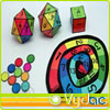
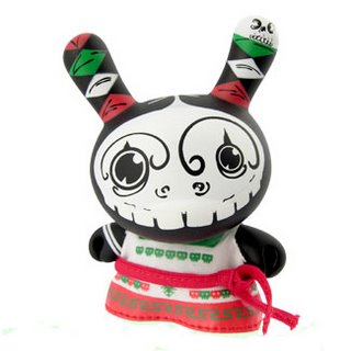
Dunnys figurines. It's like the cow's parade... different artists use the same basic figurine to create "unique" collectables. One of the latest additions is the mexican series of Dunny dolls. Quite interesting because they used the stereotypical iconography of "lucha libre" "alebrijes" and "calveras" in a modern urban context. Although their graphic design is limited to only those 3 stereotypes, (maybe because that's what other countries expect to see from mexican design...) It shows that mexican colours, patterns, styles, etc are very rich and powerful in terms of aesthetic and communication.

ciao
Bookmark and Share

Thursday, February 15, 2007

wait a second...

Today I received an invitation from the Ministry of Health to apply for evaluator for the New Zealand Health Innovation Awards. This is the fifth year of the awards which aim to:
One of the previously nominated projects that jumped into my attention is 2004 finalist:
"Paediatric Gait Assessment Clinic" Because of a high workload and the relative non-urgent nature of the condition in children with possible lower limb developmental variations known as 'paediatric gait', these children had been unlikely to be assessed for some 24 months. The project has been highly successful and has dramatically reduced the waiting times from up to two years down to four weeks while still providing effective assessment for children.
It's just incredible, I can't believe there's a two year waiting list... just to get an assessment and then to be referred for therapy... specially when we are talking about small children! Two years is an eternity... by the time they get the assessment done, it's probably too late for some of them to get the full benefit of physiotherapy and rehabilitation. I know there are two year waiting lists for adults... even for cancer tests; 6 months waiting list to do the driver's licence test, 24hr waiting list to talk to any bank manager, 3 to 4 days waiting list on car's workshops, unknown waiting time on the phone to talk to any telephone help desk like telecom, slingshot, etc. 3 days waiting list to get my computer repaired (yet again)... NZ is the country of waiting lists, just like Mexico is the country of standing in queue to go to the bank, buy tortillas, pay taxes, etc... Here, you get on the list and wait, and wait, and wait... from the comfort of your own chair.

ciao
Bookmark and Share

Thursday, February 08, 2007

Wiiiiillsoooon!

OK... you are Tom Hanks, stranded on a desert island... who would you take with you: Jane Austen or Britney Spears? You also have a choice between Stephen King or Thomas S. Elliot... and some other artists. It's all part of an interactive survey to evaluate aesthetic criteria by philosophersnet.com . Although, I do not agree with their 5 criteria as being what defines a work of art:

The work displays great technical ability
This may be the only criteria that actually applies at some level. I mean, if the artist doesn't have the necessary technical skills, it's more difficult to transmit the message. So, for me, that's a maybe.

The work is enjoyable
NO. There are many works of art that cause the exact opposite of enjoyment. There are many works of art created to cause repulsion, disgust, anger, fear... etc.

The work conveys the feelings of the artist
Not necessarily, the artist may or may not have those feelings. One may say, that usually, yes. I would say that the artist may be emotionally attached to the work, but that doesn't mean that the artist had (or needs to have) the same emotion represented on that work. One could paint a very sad image without having to actually cry a river...

The work conveys an important moral lesson or helps us to live better lives
The message on a work of art does not have to be ethical or moral. In fact, that was the view of fascist censorship, presenting a controlled depiction of what they considered moral, ethic and acceptable. Art can not (or should not) be limited to moral o ethic boundaries.

The formal features of the work are harmonious and/or beautiful
Once again, the formal features may or may not be harmonious and/or beautiful. They could be ugly, random, unharmonius. .. if, IF that is the intention. An harmonious and/or beautiful world would be a world full of kitsch! Like Kundera would say: "It follows, then, that the aesthetic ideal of the categorical agreement with being is a world where SHIT is denied and everyone acts as though it did not exist. This aesthetic ideal is called Kitsch". Just like "the Simpson's movie" trailer: "in a time when computer animation brings us a world of unsurpassed beauty, one film dares to be ugly..."

The work reveals an insight into reality
What about surrealism... or impressionism... or even "pop art" ???!

So, after closer consideration, those philosophers.com 5 aesthetic criteria are either/or: the old fashioned aesthetic ideals OR democracy is (once again) causing philosophy to take huge steps back, trying to popularize art. At the end of the quiz, you can find out the artist, that people would like to take to a desert island with them. So, who will it be you are taking with you: Shakespeare or Britney?

ciao
Bookmark and Share

Tuesday, February 06, 2007

VYDAC

"Vida y diseño A.C." is a very special association. cuentacuantosI don't know how to describe it, but they do something similar to our "liaison" projects at ITESM... however, they "are" their own liaison association to link industrial design projects from UAM students to private and state institutions, and they also get funding and sponsors for those projects to get them into actual production. Of course, I am talking about projects for people with disabilities or universal design.

10 años diseñando para la discapacidadIn their forums, I found a very good article about product development evaluation. Something that is sometimes hard to convince the students to use as a tool. Quite interesting is the fact that in order to actually evaluate ideas using a morphological matrix (2), one needs a comprehensive PDS (Product Design Specifications) list. The better the list, the better the evaluation in terms of "reflection, analysis, critic, and further R&D into areas or issues that might have been forgotten". They also published a book with their best design projects in the last 10 years. Keep on the good job promoting a social benefit of Industrial Design! Congratulations!

ciao
Bookmark and Share

Sunday, February 04, 2007

Design Idol

Today we watched a bit of "american idol" when it's the first auditions/selection stage and they get a bunch of weirdos. I guess it's the most interesting and funniest phase of the program. Anyway, for some reason I discovered that it is a lot like some design evaluations and feedback with the students at the early stage of their projects (sketching and initial concepts). I mean, you get similar reactions form the students: there are some good candidates that get the golden ticket which is like the "OK, go ahead with your design concept" and they leave the room jumping with happiness. Nothing extraordinary there, the difficult part is how to deal with the weirdos, with the ones that are "almost there but not quite", and the ones that shouldn't be there at all in the first place (like Simon would say, they should start a career in cooking, become lawyers or something). Don't cha think?

Of course Simon is too cynical... and to make it worse, he is almost always right, he just got a very sarcastic or cynical way of saying things. But besides from that, evaluating a singer or evaluating a design concept is not as subjective as one might think. It's not a mathematical result where you have a correct answer, there are many factors to consider, and the judge takes a decision based on those factors. It's just the same with a design concept, one has to consider feasibility, resources, aesthetics, proportions, functionality, and many, many other things, and put that in a simple "yes" or "no" result. I mean... how would you rate Red's performance of bohemian rapsody on a scale from 1 to 10?

Some contestants (or design students) engage in useless discussions when their project gets rejected. They try arguments like:
  • "I did my best and you should consider that",
  • "I worked so hard for this moment",
  • "You don't understand the young generations and you are wrong",
  • "I don't see what is wrong with my concept (singing), all my friends tell me that it's great, and you are wrong",
  • "I am going to make it despite your opinion and prove you wrong",
  • "I don't care about your experience, I know I am right, you are the one who has no idea about (singing) design",
  • etc, etc.
But all that is not going to change the fact that either they are in fact terrible singers, or they may be good, but not good enough to pass. Some of them accept and understand the critic, that they have to improve or change some aspect of their performance, or their design project (for this analogy). Some students actually listen to what the teacher says, and they return to their desks to work on that, while some of them try to insist and do not accept any suggestion or criticism.


OK, OK, I am sometimes (a lot) like Simon. I remember very well one of my first students at the architecture school. She designed a room so big, so out of proportion, that I drew a tennis court and a mini golf course on her drawing just to show her how big it was! Anyway, the whole point of the american idol show is precisely Simon's attitude. I just loved his guest appearance at the Simpsons. I was wondering what would happen after the auditions, if they had a terminal to fill in an "academic performance evaluation" like those we have at universities. How would all those thousands of candidates (accepted and rejected) evaluate those 3 judges? Well, for starters, he wouldn't get any salary raise, or academic rank promotion. And I am also not too certain about how they would evaluate Paula Abdul or Randy... they are also mean sometimes. What I envy from them... is that they only have to endure the torture of those auditions for a couple of days, not for a whole semester.

A couple of days ago, we saw a TV interview with Dione Warwick, who was in NZ for a farewell concert. She criticized american idol, or better said, that the young people get the false idea that success is going to happen out of nothing, just by auditioning on TV. Most of those contestants don't even know how to read music or play an instrument. They don't have any idea of pitch, tone, scale, rhythm, or any musical knowledge at all, and yet, they expect the judges to give them compliments and ultimately become pop idols without any hard work (watch the William Hung example). Well, a similar story with some design students who (honestly) believe that design is just taking a bunch of crayons which become like magic wands that create products and beautiful objects with no effort or thinking involved whatsoever...

In sum, a suggestion for design students: do not make a scene when your project or concept gets rejected at the early stages. Listen, understand, and improve based on the critic. In real life, you will have to please your client. You can not tell a client, he/she is wrong when he/she wants something changed, I mean, you can and sometimes you should, but you can not impose it just by saying "I am right, you are wrong". If design, or singing like an idol is not your thing, don't worry, you can always apply for a job with Martha Stewart.

ciao
Bookmark and Share