Coconut uniform in a Harley Davidson fridge
It was long time ago... one of those school workshops in which we had to work on a project with a team of architects, graphic designers, interior designers and us, industrial design from all semesters. The subject was an emergency shelter for disasters like earthquakes, etc... We came up with the idea of making prefab panels using coconut fibers, instead of fiberglass on polyester resin. Anyway, we designed those panels and the architects used them to build a refugee camp. I remember very well the observations of the architect's professor advisor, she said that it was a good idea to build the shelter houses in a way that they could be "customised" by the inhabitants. That is, because the panels worked just like trade show displays (they even had aluminium pole connectors) they could be arranged in many forms. We also let some of the finishing details open to the taste of the families moving into those refugee houses.
 Other customizable items are school uniforms. Well, the school authorities may disagree but some people really don't like the idea of being "uniformized". I remember the ugly green girls uniform at Autonoma's highschool... some girls slowly transformed their skirts into miniskirts. Someone told me once that she used pins, just in case the principal caught her, she would just let go of the pins, and the skirt was back to normal length. Or, you can also customize your haircut... while some people use terrible "tupees" some just cut it bald and put on some tatoos! Thing is, you "have" to customize your look.
I don't remember the name of the movie, in fact there are many movies that make reference to those "uniformed" american house developments (like scissorhands) where all houses are cloned, up to the last detail. Anyway, this movie was about someone that wanted to change the plain white mailbox with the red flag, for a very kitschig mailbox... I don't know, one in shape of a cow or something... and it started a revolution of "customizing" around the neighborhood.
Giving the user the possibility of customizing is a very good design principle. Harley Davidson makes a lot of money on "original customizable parts" they even have a big cataloge. Another example: some of us prefer to keep our cars as original as possible. I don't even let the mechanic put spark plugs that are not the same brand as the original ones... while some people love to change the alloy wheels, put some plush on the dashboard, change the tyres for tractor or slim wheels, etc, etc. It's funny or remarkable how we all tend to customize, or not, the things we appreciate or give value to. I mean, we appreciate/love our car, therefore we decide to customize it... or keep it in perfectly the original state. We personalize our fridge with magnets, stickers and pictures or we keep the doors perfectly clean...
Speaking of which, back at Tec de Monterrey, we had a project for Whirlpool to design a refrigerator for "the corner" (convenience/dairy) stores. The thing is, that "Apus" are not allowed to put other products on sponsored industrial refrigerators (the ones with window doors), So the idea was to use a house refrigerator case, and adapt it for small convenience stores. When we reviewed the pictures of existing refrigerators in real situations, I noticed that many store owners covered the glass doors with paper messages... you know: "today's special: buy 3 kilos of eggs for $3.00" So, I told the students that if store-owners are going to put their messages on the door, they should think about providing a space for that... who knows, maybe even a small piece of whiteboard to write on, that could be integrated as part of the design, and very important, without obstructing the view of the products inside the refrigerator. The students just laughed at the idea, but I still believe that design cannot always control what the users do, but they can observe, adapt and integrate those behaviors into their design.
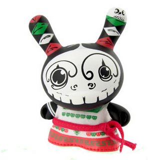
 This subject may require some additional posts later on. Today, let me finish with the Dunnys figurines. It's like the cow's parade... different artists use the same basic figurine to create "unique" collectables. One of the latest additions is the mexican series of Dunny dolls. Quite interesting because they used the stereotypical iconography of "lucha libre" "alebrijes" and "calveras" in a modern urban context. Although their graphic design is limited to only those 3 stereotypes, (maybe because that's what other countries expect to see from mexican design...) It shows that mexican colours, patterns, styles, etc are very rich and powerful in terms of aesthetic and communication.
 Other customizable items are school uniforms. Well, the school authorities may disagree but some people really don't like the idea of being "uniformized". I remember the ugly green girls uniform at Autonoma's highschool... some girls slowly transformed their skirts into miniskirts. Someone told me once that she used pins, just in case the principal caught her, she would just let go of the pins, and the skirt was back to normal length. Or, you can also customize your haircut... while some people use terrible "tupees" some just cut it bald and put on some tatoos! Thing is, you "have" to customize your look.
I don't remember the name of the movie, in fact there are many movies that make reference to those "uniformed" american house developments (like scissorhands) where all houses are cloned, up to the last detail. Anyway, this movie was about someone that wanted to change the plain white mailbox with the red flag, for a very kitschig mailbox... I don't know, one in shape of a cow or something... and it started a revolution of "customizing" around the neighborhood.
Giving the user the possibility of customizing is a very good design principle. Harley Davidson makes a lot of money on "original customizable parts" they even have a big cataloge. Another example: some of us prefer to keep our cars as original as possible. I don't even let the mechanic put spark plugs that are not the same brand as the original ones... while some people love to change the alloy wheels, put some plush on the dashboard, change the tyres for tractor or slim wheels, etc, etc. It's funny or remarkable how we all tend to customize, or not, the things we appreciate or give value to. I mean, we appreciate/love our car, therefore we decide to customize it... or keep it in perfectly the original state. We personalize our fridge with magnets, stickers and pictures or we keep the doors perfectly clean...
Speaking of which, back at Tec de Monterrey, we had a project for Whirlpool to design a refrigerator for "the corner" (convenience/dairy) stores. The thing is, that "Apus" are not allowed to put other products on sponsored industrial refrigerators (the ones with window doors), So the idea was to use a house refrigerator case, and adapt it for small convenience stores. When we reviewed the pictures of existing refrigerators in real situations, I noticed that many store owners covered the glass doors with paper messages... you know: "today's special: buy 3 kilos of eggs for $3.00" So, I told the students that if store-owners are going to put their messages on the door, they should think about providing a space for that... who knows, maybe even a small piece of whiteboard to write on, that could be integrated as part of the design, and very important, without obstructing the view of the products inside the refrigerator. The students just laughed at the idea, but I still believe that design cannot always control what the users do, but they can observe, adapt and integrate those behaviors into their design.
 This subject may require some additional posts later on. Today, let me finish with the Dunnys figurines. It's like the cow's parade... different artists use the same basic figurine to create "unique" collectables. One of the latest additions is the mexican series of Dunny dolls. Quite interesting because they used the stereotypical iconography of "lucha libre" "alebrijes" and "calveras" in a modern urban context. Although their graphic design is limited to only those 3 stereotypes, (maybe because that's what other countries expect to see from mexican design...) It shows that mexican colours, patterns, styles, etc are very rich and powerful in terms of aesthetic and communication.
ciao


0 Comments:
Post a Comment
<< Home