
"The" President is absolutely right : "
It's amazing with the software that has been developed these days that enable a camera to distinguish the difference between a squirrel and a bomb". It's a good thing to have such software, specially if the
squirrel looks like Lincoln! Seriously, I guess it depends on how good you are using that software. It seems like we can manipulate images to create almost anything... but I still believe that despite retouching, a good picture depends on the eye of the photographer, not just on the special effects. Click on the images to visit the pictures galleries by :
Zena Holloway (
video),
Mr. Toledano,
Belinda Mason and
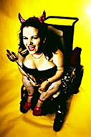
Alison Jackson.

Let's just make it clear that not every photograph is art, just like not every oil painting is art. Journalistic pictures are not art, they are just good or bad journalist pictures. Pictures of friends and family during a party or reunion are not art... and so on. Even some photographic essays, are not necessarily art. Some of them are, some of them aren't. Photography, and cinema are just a medium... whether a picture is art or not is another matter. However, there's still some magic involved in the philosophical idea of capturing a precise instant on an image. At least, it's still a wonderful concept for me. An instant that will never be repeated, and yet that exact fraction of a second will become a permanent record of time and space.
Yes, photography has become a regular thing and lost it's magic for many people. Digital imaging has made things worse, since the materialization into a piece of paper has become obsolete. Digital pictures can be deleted with no mercy, and those moments will be gone forever, whereas for traditional paper pictures... destroying a picture was some kind of a ritual (I am imagining someone burning the picture of an ex-boyfriend or something like that). Digital pictures have become ephemeral, they are no longer a permanent record, and this changes the perceived way we look at photography.
Snapshots of celebrities are important for just a matter of hours or days... then we become hungry to see the next
celebrity being humiliated or
having an embarrassing "friggin" moment. Images become a constant flow of "
infotainment" and their communication power becomes "unrealistic" or at least disguised in a fast food-like edible way, rather than being a nourishing communication tool. Women's magazines, news, and reality TV are some kind of malicious voyeurism, rather than any kind of art form. How long until we get someone like
Miss Teen North Carolina as
the word's sexiest blogger/geek!

It's the same old argument proletarians vs. elite. The problem with vulgarization, is that it devaluates the media. Half a century ago, only a few people had cameras (stills or 8mm movies), nowadays, any bozo with a cell phone can take pictures or video and post it on youTube or Flickr. What we get is the collective idea that (all) videos on youTube are just people doing stupid things. My concern is that loss of relevance, and the social construction of meanings (mass belief) that (all) digital pictures are either photoshop manipulated or just banal items. The fact, that many aficionados pretend to be professional photographers, or professional film makers, doesn't help this situation. For example, last week on a
newsletter from a NZ creative initiative, they reported that a couple of young students won a grant to visit England for a small workshop or something. Anyway, they had links to the portfolio of both students... and well...
judge for yourself. Proves my point that any bozo with a video camera or a
video game, can call himself an artist... although it doesn't mean it's true.
If you are still too stupid to handle a camera to be an artist, there's still a better job : you can become an "
international man (or woman) of mystery" . British police has launched a
Counter-Terrorism advertising campaign asking people to send their "funny videos" and pictures of suspicious terrorists.

If you
catch someone on the street or in your workplace acting strange, well... go snoop and then squeal to Scotland Yard. If your video is selected, you can win a 500 pounds and tickets to the ferris wheel every week! UK citizens can now feel safe and secure,
just like the old times when people used to denounce their weird neighbors and even odd family members. I wonder if Scotland Yard has at least some pirated copies of that amazing american software to recognize a squirrel form a bomb, or if they can use it to tell the difference between these DVDs. Here's what the Michigan police says: "
 As part of your daily routine, being observant and reporting anything out the ordinary could be the crucial first step in preventing a possible terrorist plot or threat
" Of course, that means it is our civil duty to be squealers and invade the privacy of others to make sure they are not evil. So have always your camera-cell-phone ready!

In other photographic matters, the Embassy of Mexico,
Museo de Arte Contemporáneo de Oaxaca (MACO) and
Centro Fotográfico Manuel Álvarez Bravo (CFMAB) are calling to submit pictures about Oaxaca's geography, life, history, landscapes, architecture, habits, desires, dreams, objects, past/present or any other motif that can represent Oaxaca on a collective exhibition to be presented at
MACO. They are right to say that "
the camera captures reality, but it also invents it". Just be careful, because if someone else with a camera catches you taking pictures or video of monuments or important buildings, your picture might end on the most wanted list.

 Sir Richard Rogers should be thinking about giving back his Pritzker prize (or give it to Foster
 they don't mention any collaboration with Renzo Piano
This was also another blow to London's and Britain's image in the eyes of the world, following other fiascos such as the Millennium Dome (expensive white elephant), the Millennium Bridge (unstable), and – closer to home – the Holyrood Parliament building (over-budget), the "squinty" bridge over the Clyde (broken cable) and the Science Centre Tower (non-working lift).
 No wonder that kiwi pseudo-architects like Warren and Mahoney are so incompetent, with such terrible examples form their masters! Although, Sir Norman Foster did an excellent job on the also new Beijing Airport. For starters: it's not a box shape; The idea of the analogy/reference with a flying dragon is a good example of using cultural references to develop a modern aesthetic language; The parking space and pick-up are
 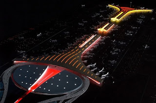 well resolved as compared to the rigid small shoe-box that came out of the big shoe-box; The overall view at user's perspective is just to die for... compared to the bulkiness and almost threatening rigidness of Richard Rogers'
 helping to reduce the amount of energy expended by the structure for heating. The golden tint, meanwhile, is meant to evoke the colors of Beijing's Forbidden City, the Ming Dynasty-era imperial palace at the city's center" In other words, the flying dragon is much more transparent and welcoming, is less obstructive and blends and respects the environment. I guess, I'm starting to prefer the principle of harmony, rather than disruption, confrontation or contrast as a form of aesthetic composition.


