Sunday, April 30, 2006

sCatsup

There must be some kiwis working at Googleplex... just look at the example of SketchUp... it's just like an average kiwi house to the last detail: boring weatherboards, the house looks like a shoebox, landscape, even the barby!!! Definately, that must be the work of a kiwi master builder.

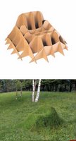
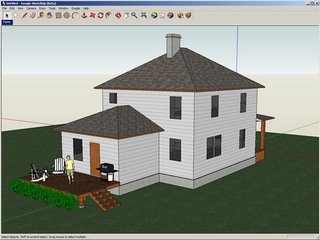
I usually do not write about these kind of gizmos or software, but I think it is interesting to put your CAD model into GoogleEarth pictures. There's no mac version yet, but I am not sure what's the idea behind freeware like that. I mean, the reviews about writely or googlepages haven't been good... I don't think that this freeware can compare to a "real" CAD program. However, It sounds interesting for exploring how projects might look like when put into their surroundings. I guess this could be useful for some students who haven't actually been to the city center.

Speaking of students. Next tuesday (May 2nd), there's a coctail party to open this year's final exibition of Architecture and Industrial Design Students' projects from ITESM campus Guadalajara. Patio del Ex-convento del Carmen, Ave. Juárez 638, Zona Centro... because of the time difference it could be a good excuse to celebrate my birthday.

ciao
Bookmark and Share

Tuesday, April 25, 2006

Frecuent use of graphic language

You know those disclaimers before some TV shows. There's one on New Zealand's TV that I believe may be misunderstood because of punctuation: "this programme contains frequent use of language that may disturb some people" I always think this refered to Gilmore Girls... their frecuent use of language is disturbing sometimes! OK, So let's now talk about explicit graphic language.

When we all agree or have the same idea about a concept, then it is a convention. That doesn't mean that we are going to organize a summit to discuss and agree on meanings. Meanings come usually from "habitus"... that means, we learn something because it is presented to us frequently, and eventually we come to accept it.

One case of a symbol being democratically discussed is the German Ampelmann. In post war Germany, both sides developed their own sign for pedestrian crossings. After the re-unification, the west tried to change the so called ampelmänner used in East Germany and impose their Westmann version. It didn't work, and the ampelmännchen stayed... until now. The European Union is now trying to unify all traffic symbols, which means the sympatic guys and their hats are again in danger.

AIGA developed a series of "unified" airport signs, because there are regional versions, which makes them sometimes hard to decypher to international travellers. (via "the trademark blog") Iain Anderson made a short film called "airport" using those symbols. Graphic Artists Guild developed a set of 12 symbols related to disabilities. It is not a bad idea, now that communication needs to be "universal". Please note the term "communication". As High Desert Wanderer points out : In it’s classic sense, graphic design is about arranging elements in a way best suited to communicating a message. Again, any frecuent use of language may offend some viewers.

ciao
Bookmark and Share

Monday, April 24, 2006

Surrealist building

Sandra is right. New Zealand is a surrealist country too. There's almost one million people living in Auckland... and more than 900,000 cars in this area. There's only one bridge to cross to the north shore... and it doesn't matter from which part of the city you come from and where are you going, all major motorways converge to the city center. No wonder that there's always cogestion at the so called "spaghetti junction".

Now the plan is to charge $10 per day, to all motorists crossing or going into the city. "The Ministry of Transport's Auckland Road Pricing Evaluation Study examines road pricing and parking levies as a means of reducing congestion and raising revenue for investment in land transport." Well, if you charge $3,500NZD per car, to all 900,000 vehicles... that is a good way of increasing revenue. They could also charge a levy of $10NZD per window on your car... or $20NZD per wheel... and we would have a very "retro" middle age taxation system. What the city needs is public transport! People are not to blame for having too many cars, when the city's public transport is a nightmare.

It all starts with bad urban planning. There are too many apartment buildings at the city center. I am not familiar with the regulations, but it seems to me, that the number of compulsory parking spots per persons using those builldings is too low... or probably there's no such regulation.

Speaking of bad regulations. The new building regulations will give full monopoly to the "master builders". My opinion is that they already are like a mafia, and too much overprotected. Can you imagine empowering the mexican maistro albanil? That's why the bulilding standards are like Sandra said, like the "pioneers" times. I haven't got time to write about it, but trust me... the construction methods and materials are terrible. And I blame the masters builders. Giving them full monopoly over design and construction... may God have mercy on us! or we may end up with buildings like the "upside downer", "crooked house" or the "135 deg house". I heard recently that the roof of the new Auckland stadium collapsed. No wonder if they build skyscrapers with wooden thootpicks!

"Historias de casas" has a very nice collection of houses explained. Also enlightning is this article about modern buildings by Slate Magazine. (via) Quite interesting (but not my favourite) is slide nr.8 : Louisville time-line skyline, there's Mies van der Rohe, Philip Johnson and John Burgee's domed neoclassical tower and Michael Graves' controversial Postmodern icon, the Humana Building. Another example of strange buildings is the Chiat/Day Building by Frank Gehry, which seems inspired by the Bizarrquitecture from Worth1000, well, no surprises there.

ciao
Bookmark and Share

Friday, April 21, 2006

Kiwiaventuras

kiwiaventurasYet, another project... now we have another blog for our world famous "Kiwiaventuras". I hope you enjoy it.

ciao
Bookmark and Share

Monday, April 17, 2006

Web dogma

Like I've said, I'm no expert on web site design, but some experience has made me wiser. Just look at one of my first websites... it was terrible, but that was 10 years ago! Just like Bruno Munari said: don't try to re-discover the black thread! If someone already has some experience in something, well, see what you can learn. What I mean is, if someone is going to design a website... well, then take some advise from experienced designers, that way you are not going to make all the same mistakes, just only a few.

I found ITESO's promotional site for their "international design day" on april 26/27th (via). I don't want to be too critical, but... it's not the Engineering or Theology congress, it's a design congress, and the web site should be indicative of good design, don't you think? Let's review some of the flaws:

I know it's the Jesuits University, but... the cathedral ambience may scare some people out. Again, coding and decoding of meanings shouldn't be taken so light. The encoder (designer) might think that using the religious ambient is just that, the ambient. Well, dah!!! Decoders (visitors) might start to wonder if there's going to be a religious service to open the congress.

Excesive use of flash. There are many web development sites discussing the issue of flash. For starters, spider-bots can't crawl swf links, some of them don't even crawl images with links! So, your listing on search engines is limited to those using keywords, and that means no ranking on google (google doesn't use keywords on their algorythms).

More about flash and usability: the idea of having a shortcut to skip the flash intro is a courtesy and it should be visible during preload too. I don't think it is a courtesy, when you have to wait 10 minutes for the entire clip to load until the skip intro button is visible. Speaking of loading time... always check your files and pages using the worst computer or connection. Flash has a testing menu, where you can select to test your movie for those using dial-up internet for example. It takes 10 to 15 minutes to load a flash movie that is 3MB on dial-up internet, I guess not many visitors would have the patience to wait that long. I bet that the same interactive menu, plus the 4 posters would load much faster and effectevely using simple jpegs and javascript like mouseovers, etc.

Always compress your images and resize them before using them. It is a common error to resize the images once inside the library (word files are also a good example). If you import a picture that is 3MB into a flash or word file... it doesn't matter if you resize it inside your document to make it look as small as 1 px by 1 px... it will weight the whole 3MB anyway. So, don't be lazy... and resize your pictures beforehand. If you know that the image is going to be 360x240 @ 72dpi, well, resize your image, and please... compress it at least 70/80%.

Many good tips on how to design a web site can be found at Ben Hunt's Web design from scratch. There's very good advise on many issues like: how users look at websites, decoration, golden rule of web design, conventions, etc... or you can wait until your website is listed on Web Pages That Suck, and then read about the mistakes.

Once again, if someone already knew about all this... it is wise to learn about it before making those mistakes. Anyway, good luck with the seminars and conferences. I haven't heard about a "designers day", now I know what postmen and secretaries should feel about their days.

ciao
Bookmark and Share

Sunday, April 16, 2006

Cuckoo apples & bananas

Sandra had a coupon for 10 movies for 10 bucks, so... we have now plenty of movies for the long easter weekend. Today we started by digesting 2 Woody Allen movies. After all this time, I forgot about the giant... I wonder if they ever found the other pair... or if it's still running unrestrained!

Speaking of movies, I just found out about the simpsons' movie. I wanted to see the trailer, but unfortunately that requires quicktime 7. Problem is... that I have Mac OsX.2 "Pussycat" and most of the updates like quicktime 7 require 10.3! It's just terrible. A couple of weeks back, I told you that I wanted to make some flash games... well, I have studio MX, but the upgrade for some new features only runs on OSX 10.3 , etc, etc. My question is: why is apple discriminating against OSX 10.2? My computer is just 3 years old and is already obsolete for any kind of update. I needed a disk defragmenter in January (that was the cause why my computer was running so slow when I was in Mexico, first I thought it was a cultural issue, you know... my laptop taking a siesta under a cactus) Anyway, I couldn't get a disk defrag because the ones for OSX 10.2 are discontinued. Worst of all, the new Leopard is coming soon. In my opinion, those updates souldn't be called OSX... they should be OS 11, etc. if they are so much different to leave out the previous versions, they shouldn't be called the same.

A couple of months back I received the alias-wavefront newsletter announcing the merger (or sale) to autodesk. I had the hope to have some day a Mac version of StudioTools... but now that they bacame autodesk, all hope is gone. Nevertheless, the world domination of the evil empire doesn't end there. Apple announced bootcamp... now you can choose if you want to start your mac from the mac hard drive or a windows hard drive partition. Note that it is not the emulator for virtual PC... this is the real deal... running windows using the duo core devil inside. In their own words: "Windows running on a Mac is like Windows running on a PC. That means it’ll be subject to the same attacks that plague the Windows world".

If you have any ideas on how the computer of the future may look like, here's the 2006 start something PC competition (now called Next Generation Design Competition). In sum, if a couple of years ago, a merger between Adobe and Macromedia, or Alias and Autodesk were unthinkable... is it possible that we are approaching a merger between mac and pc? How is it going to ba called? Winpples? Applows? Micro-apple? This world is definately going cuckoo bananas!

ciao
Bookmark and Share

Thursday, April 13, 2006

Coffee of toilet fuel

Just in time before holydays, the petrol price went to the roof. Now that we have 2 cars it will be a nightmare to pay for fuel. We thougt that by having two cars we wouldn't have to refuel as often. I mean, intstead of every week, it would be every fortnight... and in fact, every month, because the use would be also divided by 2. How wrong! It reminded me of Don Norman's article about toilet paper... basically, someone invented a toilet paper holder for two rolls. You know it's a terrible thing when there's a need for paper and the roll is almost empty. The idea of having two rolls, is that the next paper roll will be there ready when it's needed. What happened in reality is that both rolls ran out at the same time!
Having two tanks to refuel gives the same problem. One usually takes the car with the most fuel, and at the end both cars will be empty at the same time, generating a larger bill at the petrol station. Anyway, speaking about fuel, I found a common denominator and it was like a sign to write something about designer's fuel. Besides, all that talk about the caffeine chewing gum got me thinking.

ThinkGeek has a whole range of products for caffeine addicts like: caffeine body gel / bath soap, so that your body can absorve your dosis while you take your morning shower... a caffeine inhaler, pretty much like the asthma inhalers, when you start feeling a desperate need of a fix... lips balm, to give coffe kisses (recommended only if your partner likes the coffe taste).

DesignBoom has a rather kitschig option: a coffee machine (of the future?). I think it's just kitsch and not modern. I can imagine the comic book guy having one of those... but not on a decent minimalistic environment.

My favourite discovery is this. It's not because of the actual design of the coffee machine. I mean, the design is OK, modern, simple, it's very good. But the fact that Sowden Design is showcasing drawings, sketches, renders and engineering/assembly images of the products they developed it's even better! I think it's a great site to look at the actual industrial design process. After looking at some of the hand sketches, I promise, I will never complain again about my student's indecipherable drawings. It's nice that a company like that allows students (and other interested designers) to see inside the real life design process. Good on you mates!

ciao
Bookmark and Share

Sunday, April 09, 2006

Identity crises

As I've been saying lately, now that the standers are almost ready to hit the stores... if we manage to get them shipped first. (he, he) I am working on the website, catalogues, instruction manuals, etc... Basically, what they call "corporate identity". I do like our Special Kiwis logo, and our business cards I believe they are not so bad. I mean, they are not the clip art or template made like the ones you get at office depot. But I am not a graphic designer either. Meaning: I stink as graphic designer. Check out Isopixel's blog (in spanish).

I always tell my students that the main difference between architecure/industrial design vs. graphic design is a little thing called "third dimension". It's not easy to handle three dimensions, one needs to be able to see, rotate and explore your mental ideas in 3D. However, graphic design is not easy either. To be confronted with a fixed canvas size and communicate ideas in an appealing way using a flat surface is easier said than done. Sculpture and painting are also different kinds of art. One can not say that one is more difficult than the other. They are just different, and both require expert skills. By "expert"... I mean rigorous training, knowledge, creativity, etc... Anyone can get a pirate copy of Corel Draw (for 2D) or 3D studio, but that doesn't make him/her a (good) designer.

Here are the results of an international graphic design competition on branding (logos and corporate identity). It's a must see if you are interested on 2D design. (via) By the way, check out the grid used to create the 1st place logo. Proportions are not arbitrary.

ciao
Bookmark and Share

Friday, April 07, 2006

Negligent gardner

Ok, ok... I negleted this blog for a week. I've been quite busy trying to finish the special kiwis website that I didn't have the time to browse for news 'bout and 'round design. Coudal Partners had an intriguing puzzle last week: Da Vinci's other code. Sorry for not posting about it earlier, It's been solved by now. But if you keep away from the answers you may find something interesting to do during this weekend. Also via Coudal, there's this cardboard chair that converts to a garden chair literally. I am not sure how you are suposed to mow your chair... or sit on it after putting organig feritizer.

ciao
Bookmark and Share

Saturday, April 01, 2006

Rid and rite

Congratulations to Luis Enrique Taffinder, Mario Eduardo Torres and Luis Felipe Romo; architecture students at ITESM campus Monterrey, who won 1st, 2nd and 3rd place in an essay contest about Latin American architecture called by the Unversity of Melbourne. Like Antonio Garza said: "to do quality architecture, one has to be critical, (read and) write and apply that analysis to one's work".

I agree, that students need to read and write more about what they do. That's why I find quite interesting Raul's idea of having his students to document their works in form of a blog. After just a couple of months they are more confortable writing about their creativity process and describing their works accurately and not just with youth slang like: "this is my project, it's kinda cool, osea, first, it was like: no way, and then I said: sweet, which is cool, and it has these cool kind'a stuff..."

Olga (a russian teacher and friend at ITESM campus Monterrey) learned to say in spanish "se la bañaron" (and use it in all appropriate circumstances) causing us to laugh until it hurts, because she used that phrase just as a natural regio. I really do have to include something about Gandhi bookstore's advertisment campaigns. Those are really hillarious... or sarcastic. I almost believe the idea of a complot against reading denounced by el peje... they say that there's a government control strategy to keep people ignorant. I met a student at Unitec (NZ) who said (as if it was something to be proud of) that he passed high-school without reading any book, not even text books... and he complained why would he has to start reading about design or ergonomics. And believe me, students like that, they do graduate eventually (and that's no april's fools' joke).

In other news, now that our friends Hugo and Astrid moved to Atlanta, here's a new product from Coca-cola company, it's called coca cola black. (via) It's not that the product is aimed at african-american consumers... their target public are night-owls, adults with a strong coffeine addiction. It contains half the sugar but double coca-cola syrup and real coffee... like drinking an expresso frappuchino, without having to run to the next starbucks to re-fuel. I guess it will be a success among stressed office workers, designers, architects, people who read (or write) books, and all other groovie coffee adicts. I prefered vanilla coke anyway, sad that it's been now withdrawn from the shelves.

ciao
Bookmark and Share