Identity crises
As I've been saying lately, now that the standers are almost ready to hit the stores... if we manage to get them shipped first. (he, he) I am working on the website, catalogues, instruction manuals, etc... Basically, what they call "corporate identity". I do like our Special Kiwis logo, and our business cards I believe they are not so bad. I mean, they are not the clip art or template made like the ones you get at office depot. But I am not a graphic designer either. Meaning: I stink as graphic designer. Check out Isopixel's blog (in spanish).
 I always tell my students that the main difference between architecure/industrial design vs. graphic design is a little thing called "third dimension". It's not easy to handle three dimensions, one needs to be able to see, rotate and explore your mental ideas in 3D. However, graphic design is not easy either. To be confronted with a fixed canvas size and communicate ideas in an appealing way using a flat surface is easier said than done. Sculpture and painting are also different kinds of art. One can not say that one is more difficult than the other. They are just different, and both require expert skills. By "expert"... I mean rigorous training, knowledge, creativity, etc... Anyone can get a pirate copy of Corel Draw (for 2D) or 3D studio, but that doesn't make him/her a (good) designer.
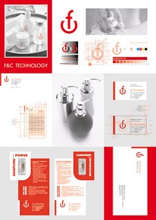
Here are the results of an international graphic design competition on branding (logos and corporate identity). It's a must see if you are interested on 2D design. (via) By the way, check out the grid used to create the 1st place logo. Proportions are not arbitrary.
ciao


0 Comments:
Post a Comment
<< Home