Rudo contra Tecnico
 Sir Richard Rogers should be thinking about giving back his Pritzker prize (or give it to Foster
 they don't mention any collaboration with Renzo Piano
This was also another blow to London's and Britain's image in the eyes of the world, following other fiascos such as the Millennium Dome (expensive white elephant), the Millennium Bridge (unstable), and – closer to home – the Holyrood Parliament building (over-budget), the "squinty" bridge over the Clyde (broken cable) and the Science Centre Tower (non-working lift).
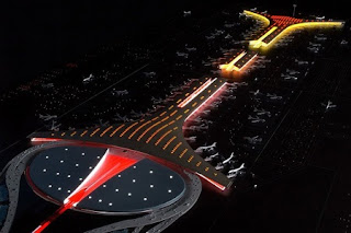
 No wonder that kiwi pseudo-architects like Warren and Mahoney are so incompetent, with such terrible examples form their masters! Although, Sir Norman Foster did an excellent job on the also new Beijing Airport. For starters: it's not a box shape; The idea of the analogy/reference with a flying dragon is a good example of using cultural references to develop a modern aesthetic language; The parking space and pick-up are
  well resolved as compared to the rigid small shoe-box that came out of the big shoe-box; The overall view at user's perspective is just to die for... compared to the bulkiness and almost threatening rigidness of Richard Rogers'
 helping to reduce the amount of energy expended by the structure for heating. The golden tint, meanwhile, is meant to evoke the colors of Beijing's Forbidden City, the Ming Dynasty-era imperial palace at the city's center" In other words, the flying dragon is much more transparent and welcoming, is less obstructive and blends and respects the environment. I guess, I'm starting to prefer the principle of harmony, rather than disruption, confrontation or contrast as a form of aesthetic composition.
ciao


0 Comments:
Post a Comment
<< Home