
Miss Leading
 Today was Waitangi day. We went to Mission bay and walked down to Okahu bay's festival (pictures here). I found many things to talk about, starting with this picture of a police information stand for new recruits. Their advertisement strategy (slogan) is very similar to this TV advertising for the Royal New Zealand Navy. Check out the images of recruits playing rugby, having a disco party, and then listen to what they say to their mums about fishing, playing video games, etc. The RNZAF followed this kind of advertising, their description: "Step Up New Zealand TV ad (student). The video shows students in a classroom with a teacher in Auckland. A New Zealand Defence Force helicopter flights onto the building is picking up a girl student from the roof to stepup and join the RNZAF." They certainly rescued her from a "boredom death"... or a deadly maths indigestion!
If the idea for recruiting young people is something like "don't get bored with high school maths" "sail the world while partying and playing video games on our boats" "protect and surf" ... well, I would be concerned that they get the people with the right attitudes and values like discipline, preparedness, hard working, moral values, etc. I mean, those are the values we usually associate with that line of work, not necessarily partying, gaming, surfing and sleeping during class. In that sense the Force 9 game and "have you got what it takes?" advertising for the NZ Army is more appropriate: challenging to decipher codes, take life saving decisions, etc. I am not endorsing any kind of military, fax machines, or political discussion. I am just saying that it seems to me to be misleading to recruit young people into the military/police by using messages like: just have fun, play video games, have a party, don't attend boring lectures, come to surf, etc. instead of : study hard, be prepared, be disciplined, have values/integrity, etc.
 Back to the Waitangi day festival. Can anyone tell me what to put on any of these bins? It's just a terrible design. No wonder that only a few people recycles! The information is so small that is impossible to read, nobody is going to take the time to stop and read such small text. They should have used pictograms and huge, HUGE titles : organic, glass, cans, whatever... then use colours that could be easily associated with those groups of items. Like using blue for glass, grey for aluminum cans, brown or green for organics, etc.
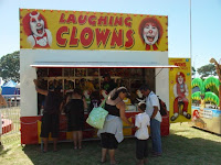 Speaking of horrible graphics, just look at this "scary laughing clowns". No wonder that a recent survey showed that children find clowns to be scary... and I thought that mexican fair's iconography had bad taste! Last but not least, my favourite picture today: spider pig a.k.a. puerco araña a.k.a spider cochon a.k.a. spider schwein... "Oh, my summer love".
ciao
posted by Fernando Vallejo at 11:58 pm
![]()
![]()


0 Comments:
Post a Comment
<< Home