Monday, September 29, 2008

Designical irony

There's something incongruous or maybe ironic about so called "good design". I mean, one would think that someone who buys an object that has been praised for its good design, would probably (or generally) have good aesthetic taste. Am I right? Well, just to follow up on friday's post about good design awards, specifically IDSA's IDEA awards... where practically all the range of apple products won an award (specifically for aesthetic reasons)... one would think that the people buying those millions of iPods and iPhones would have at least some degree of appreciation for minimalism. I would certainly think so. Then, how you explain kitschig accessories like :

iCarta"The iCarta is a toilet paper dispenser and iPod player in one. You’ll be relieved to know that the dock comes with two USB ports and also works as a recharger, letting charge your iPod and listen to music while you download."(podcastingnews' top Ten Worst iPod-Related Christmas Presents Ever) ...if you prefer something to substitute the sports illustrated swimsuit edition in your loo have a look at the iPod bra too.


iDog"Meet Hasbro's I-DOG -- the little dog with BIG sound! Just plug him in to your music player and I-DOG plays your music through his built-in speaker or your headphones -- and rocks out! Wanna dance with I-DOG? Try placing him near a speaker and dance along as he grooves to the beat. I-DOG even changes his mood to suit your music."
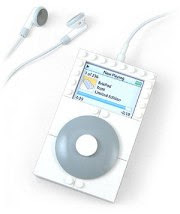

BrixPod"Think Apple fans are, um, passionate? Then you don't know enough Lego aficionados. Combine the two obsessions and you get sites like PodBrix , where the designer known as Tomi modifies and assembles Lego pieces to create Apple-centric figures and dioramas. In 2005 he created the BrixPod Classic, a case for the first iPod Shuffle that looks like a cross between an original iPod and a Lego brick." (found on Mac World's 5 wacky iPod cases)


iLegoThe lego bricks dock for iPods. "Would you have ever guessed that your old toys would one day be playing all of your fave tunes?! Fun speaker runs off of iPod’s energy and no batteries are required! Plus signs are your speakers with volume buttons in between!" (product page via blog.wired)
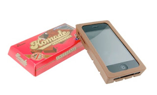

iChoco"If you’re planning on sticking with your iPhone Classic, you love silicone chocolate, and you want to have an even more deformed pocket silhouette than you already do, then you can pick up this case for $29.99 from gizfever. You get the nifty box with a screen protector and brown silicone iPhone case." Chocolate Style Silicone case for iPhone 2G (technabob.com via swissmiss) the only concern is that this chocolate bar may not be "melamine free".


iDonutIf you think the new apple aluminium keyboards are too thin... or you would like your desktop computer to combine with your chocolate iPhone, here's a chocolate keyboard. If you still have the geek munchies, this Freshly Baked USB Drives memory sticks from Vavolo are not only for macs... but they would help fight mac book air's anorexia. (chicageek)


A Kawai overdose : "From Japan, of course, comes this Hello Kitty speaker that connects to your iPod or any other audio device, and then allows you and the Kitty DJ to dig the music together. Hello Kitty in a DJ booth with a speaker in the base is a pretty cool juxtaposition of dance music and Kitty. She even bops her head back and forth with the music. Hello Kitty Speaker features a DJ style Hello Kitty who bops her head back and forth."


iBeerGot iMilk? Got iBeer? got the iMunchies? Hottrix has them all for your iPhone: "Brew and drink beer on your iPhone and iPod touch. This hilarious sight-gag is fully interactive and behaves like a real glass of beer thanks to the iPhone sensors and our spare time. Tilt to sip, shake for foam, even pour iBeer from iPhone to iPhone. iMilk is a portable dairy farm for your iPhone and iPod touch. Drink milk and whip cream from the comfort of your pocket... and now... there's even iMunchies: From Hottrix, infamous creators of iBeer, comes the answer to snack attacks. Your iPhone becomes a popcorn machine. The all-you-can-eat sensation!"


And this one directly from the apple store itself: the knockoff of the free iSock (or iSuck?) "Dress your iPod up in any one of six vibrant color socks (green, purple, grey, blue, orange, and pink). This set of knit socks provides a stylish, fun, and practical way to protect your iPod. Forgive us if we're stating the obvious, but here's how it works: Just slide your iPod into the sock to keep it safe and warm. Slide it out to dock or change playlists. It's as easy as... putting on a pair of socks."

OK. I'll post some other non mac geek-kitsch later. I'll just close with this "mac book touch"... the mac that will never be... and should have been made 5 years ago.

ciao
Bookmark and Share

Saturday, September 27, 2008

Master's courses at SPD

SPD

Enrolments to Master’s courses at Scuola Politecnica di Design SPD are open:


Master Interior Design


Master Industrial Design


Master Car Design
in collaboration with Alfa Romeo


Master Visual Design


Master Web & Multimedia


Mid – University Master Course in Interior Design
in collaboration with the Design Faculty-Politecnico of Milan

SPD is the first design school established in Italy. Since 1954 the school has been training designers and professionals of visual communication coming from more than seventy countries all around the world. Master’s Courses at SPD are professional advanced courses carried out with companies and design professionals.


For information:

SCUOLA POLITECNICA DI DESIGN - SPD
Via Ventura 15 — 20134 Milano. T. 0226413083
www.scuoladesign.com info@scuoladesign.com


Bookmark and Share

Friday, September 26, 2008

za za za mesa que mas aplauda

The countdown is on for the final of Electrolux's Design Lab 2008. This year's jury will be: fuseproject founder Yves Béhar, Axis FormLAB Design Director Jiao Mo, Senior Design Manager for Nokia Younghee Jung, and Sr VP of Global Design at Electrolux, Henrik Otto. I'm certainly looking forward to see their presentations! All finalists are ready with their prototypes, and the excitement is rising, as october 9 approaches. You can see pictures of the prototypes on flickr, watch the video presentations on YouTube, or visit their blog for the latest news about design lab 08.


Although the scan-toast is quite similar to Sasha Tseng's toast messenger concept, it incorporates some new ideas and it's creator, scan-toasterSung Bae Chang, developed a mechanism with a network of toasting "modules" (hot wires that rotate within a 30 degree radius) that burn the image or text you have selected onto the delicious slice of your choice.

A while ago, Raul sent me a link to "the best global design of 2008". I think that "the best" sounds a bit pretentious, and "global" may be a bit misleading, since most of the winners are still american, and I said "still", because IDSA has been trying to "globalize" their awards lately. Some years ago, they focused on american designers and american companies because their audience was moslty local. In fact, I believe it was closed to any international entries until just recently. But nowadays they are expanding and trying to get international entries just like other design awards, in order to get international credibility. It's a similar credibility issue just like the oscars or grammys or even the C. Montgomery Burns Award for Outstanding Achievement in the Field Of Excellence, the selection may not be biased, but the public's perception that judging is inclined towards "giving the award to the economically successful and not necessarily the best candidate" is quite strong.

Another interesting award is the da Vinci Awards: "The annual da Vinci Awards® recognize the most innovative adaptive and assistive technologies that enable equal access and opportunity for all people, regardless of ability. These innovations play an important role in helping people overcome physical limitations." I just love how this year's award went to a small, simple but yet forgotten need. This is the "universal design" award... maybe it could be our goal to get one of those awards someday.

ciao

PS: what about today's post title??? Well, the singer/writer of that song was kidnapped today but somehow managed to escape. He was lucky not to be stomped by a runaway elephant when he was escaping.
Bookmark and Share

Sunday, September 21, 2008

Victoria's freebies

A friend asked me for a list of 3D modeling and animation freeware, so I was searching for the PC versions, when I found DAZ3D... which is the free version of poser:
DAZ Studio is a feature rich 3D figure posing and animation tool that enables users of any skill level to easily create stunning digital imagery. daz 3dWhether you're a 3D newbie or an avid 3D artist, you'll find DAZ Studio is the perfect tool for designing unique digital art and animation with virtual people, animals, props, vehicles, backgrounds and more. DAZ Productions originated as the Poser-production division of Zygote Media Group, Inc., in Provo, Utah where the content included within Poser 3 and 4 was born. After creating the default content for MetaCreations, Daz developed the "Millennium Woman" Victoria and the "Millennium Man" Michael figures. In December of 2000, DAZ branched off from Zygote, and became a freestanding corporation.
One of my favourite freeware suggestions for Roberto was Scratch. It's an interactive content creator for children that uses "script blocks" instead of worrying about writing the scripts. This allows them to create their own games and movies, by creating new content or by "remixing" other people's projects... although not just kids can use it to create games or animations.
Scratch is a new programming language that makes it easy to create your own interactive stories, animations, games, music, and art -scratch- and share your creations on the web. Scratch is designed to help young people (ages 8 and up) develop 21st century learning skills. As they create Scratch projects, young people learn important mathematical and computational ideas, while also gaining a deeper understanding of the process of design. Scratch is available free of charge, go to Download. Scratch is developed by the Lifelong Kindergarten group at the MIT Media Lab, in collaboration with the UCLA Graduate School of Education and Information Studies, with financial support from the National Science Foundation, Intel Foundation, and MIT Media Lab research consortia.
ciao
Bookmark and Share

Friday, September 19, 2008

Diplomado de Ecodiseño

Diplomado Ecodiseño UdesDiplomado de Ecodiseño – UDES Puebla

UDES Universidad de Ciencias y Desarrollo, con sede en la ciudad de Puebla, convoca al Diplomado de Ecodiseño.

Objetivo: Propiciar el interés de los estudiantes y profesionistas de los diferentes campos del diseño por los problemas ambientales y sociales que en la actualidad estamos enfrentando, así como explorar alternativas dentro de su ámbito profesional y académico utilizando herramientas que permitan realizar un diseño ecológico y socialmente comprometido.

Contenido temático:
1. Problemática ambiental, ecología social. Experiencias y alternativas ecológicas.
2. Métodos de análisis de materiales y ciclo de vida de los diseños.
3. Sensibilización y estimulación a la creatividad. El consumo, lo social y lo cultural.
4. Aplicación y prácticas hacia un diseño ecológico.

Dirigido a: Estudiantes y profesionistas del diseño
Duración: 100 hrs. / 13 semanas
Cupo Mínimo: 15 alumnos.
Impartido por: Lic. Haydeé Girón Rivas, Mtra. María Laura Goñi, Mtro. Ricardo A. Pino Hidalgo y Lic. Nora Souza Baamonde; con la participación de la Mtra. María Laura Peña como invitada.

Fechas: Del 24 de octubre 2008 al 21 de febrero 2009

Horario: Viernes de 16 a 20 hrs. y sábados de 10 a 14 hrs.

Costos: Inscripción $ 2000.00 y 4 pagos de $ 1000.00

Informes:
L.D.I Jabin Mora Espinosa
Cordinación Diseño Industrial
www.udes.edu.mx
Tel : (222) 576 14 26 ext. 107
33 Poniente 1306-A, Col .Volcanes
Puebla, Pue.

Bookmark and Share

Thursday, September 18, 2008

No dewd left behind (bars)

Today was Sandra's graduation from her postgraduate diploma. I won't go into much gossip about the speeches, but one of them opened with a comment about a team wining a rugby match last weekend... didn't he realize it was a graduation ceremony, not a pub conversation amongst kiwi blokes? Anyway, he mentioned a video on YouTube regarding new paradigms in education. You know I'm very skeptic about recent education policies. My reason? Well, despite growing numbers of graduates around the world, and so many praise about using new technologies in education, and student centered learning, etc... the reality is, that many of those students are not well prepared.


The new generation may be (somehow) technologically literate. They can send text messages faster than meets the eye, and they spend thousands of hours on the internet... but that does not mean they can spell or write using correct grammar. Policies like "no child left behind" only mean what Varela used to say: "if they don't die, they'll graduate". Those policies when implemented, only serve to push up "the numbers" but deteriorate the quality of the education, and that's a mathematical rule called "minimum common denominator". We can't cheat the minimum common denominator rule, and the only ones affected are average to top students, who will now get an education to the level of the lowest common denominator.

Don't get me wrong. I am not against using technology or computers in the classroom (if they are for working and studying, not for gaming and watching funny videos). I asked my students to put a portfolio of their work on html and burn it into a CD more than 10 years ago! But we shouldn't fool ourselves, a lot of students from younger generations are not learning the appropriate skills and knowledge, they are just "having fun" by (pseudo)-learning, and we are responsible for letting them get away like that.

Again, don't get me wrong: Yes, learning is not about being boring, but it's not about learning how to type SMS text messages faster either! or researching a school paper solely on information found on google (google's algorithm will show the most popular results first, not necessarily the most relevant or the most trustful data). Having 200 people "collaborating" on a wiki discussion about education is not education... is just a discussion! Let's not fool ourselves... those kind of demands are not about raising the standards in education, they're about bringing "so much entertainment" to the classroom (they're saying that). And what does "schools nowadays have so many restrictions" mean???! Those kids have absolutely no idea about restrictions and discipline... Excuse me, but those are the 2 basic items which many students are not learning nowadays! Again, we are letting them get away with it.

In old analog times, people would meet on a coffee shop, restaurant or "music cafe" to discuss about art, politics, gossip, and many other subjects. It's the equivalent of today's myspace, discussion groups, social networking, etc. I don't recall that our old schools included "coffee shop" skills in their curricula. Although, in Monterrey I used to take my students to the cafeteria and have some of our design discussions there. The reason was that the traditional classrooms with big heavy drawing tables are ment for individual work, and it was quite difficult to get students involved in a group discussion (not to mention how difficult it was to move 50kg tables around the classroom) we moved those heavy tables a couple of times to make a big circle, but it was much easier to sit on the cafeteria on a big table. I asked the dean for classrooms with meeting tables, I even designed some modular tables for that, but I had no luck convincing the director to get appropriate furniture. So one day I decided to just take my students to the cafeteria and our furniture problem was solved. However, cafeterias are not an appropriate learning environment. What I mean, is that web 2.0 social networking may be a tool for some kind of collaborative work in schools, but let's not move our students from a classroom to a coffee shop all day where they get distracted by shinny objects and the smell of coffee and brownies! Although some starbucks addicts may be happier that way.

I don't think that students will actually learn better by getting their lectures on a Blackberry 3G phone. I don't think they will actually watch a full 50 min video of a lecture on advanced calculus... If there's not someone hit in the groin during the first 20 seconds of the "advanced calculus lecture" video, they will probably get bored and start searching on youtube for the video of Galilea Montijo naked, and girls would probably search for Fernando del Solar or something. It's just funny how this ITESM promotional is responding to the "shift happens" video "we are prepared for problems that we haven't imagined, for technology that hasn't been invented yet, and solving problems that we don't know are problems yet" You see my point? We are falling for that kind of nonsense!


Let's put it in a simple way using a similar rationale as "shift happens". Back in the age when people was amazed with brand new TV sets in their homes, telecommunication was changing our world. From doing whatever they were doing before having a TV (probably listening to the radio), people sarted to spend more and more time watching the tube. If "people watching the telly" were a country, it would be the largest country on earth... even larger than fakebook! Back then, there were millions of "RSS like" subscribers to radio and TV programs like Cri-cri or La Tremenda Corte de Trespatines... but it didn't mean that TV entertainment should be brought to the classrooms. Yes, TV and video media have been a helpful tool in education, but let's not use the "millions of views record" as rationale to implement that technology in education. It would be as silly as saying: "millions of people around the globe watched the olympic games, the super bowl and the futball world cup on TV, let's bring TV's into our classrooms bacause of that".

My parent's house phone number used to have 5 digits not so many years ago, now it's 8 digits! Residential phone lines grew exponentially since the 50's... it is still an indicator of "developed countries". Millions of "normal" phone calls are made every day... probably more than the 2.7 billion google searches each month. But that doesn't mean we have to provide a phone line to every school-desk... not even every classroom. To elevate Google to a divine level using "B.G" (before Google) is a bit frightening. Making virtual divine idols of technology gods doesn't seem like a good idea, sounds to me more like idolatry of false ideals.

There are 5 times more words and phrases in the english language than in times of Shakespeare: Dewd/Dudette, gigabucks, Frack!, Gr7, iPhoney, etc... and those are used more than 27/4! WT@!

ciao
Bookmark and Share

Wednesday, September 10, 2008

LHC

I've been looking forward for today's start of the Large Hadron Collider at CERN.


“The LHC is a discovery machine,” said CERN Director General Robert Aymar, “its research programme has the potential to change our view of the Universe profoundly, continuing a tradition of human curiosity that’s as old as mankind itself.”


quark flavorsI have my own theories... and lots of questions and doubts about the current particle models... and I guess that scientists have even more questions and doubts. earth advisory boardOne thing is for sure: there will be no black hole devouring the earth! (at least that's what the renowned M.C. Hawking says by endorsing the informative LHC rap) If that were the case, we all would have miniature black holes like freckles, from exposure to cosmic rays! Anyway, I prepared a kaleidoscopic tribute to this milestone: Leptons, Quarks, Strings (unfinished) and even a Feynman "penguin" diagram. Enjoy.

ciao
Bookmark and Share

Tuesday, September 09, 2008

Design Innovation Forum

aucom
Time: 4:30pm Date: Thursday 25th September Place: AuCom Conference Centre, 116 Wrights Rd, Christchurch.

Please RSVP to Sara Wells s.wells@aucom.com by the 15th September.
Bookmark and Share

Saturday, September 06, 2008

Evil Twins and Quadruplets

Miguel from Merida or Jean Nouvel?Raul sent me this "riddle". To be honest, I didn't knew what he was talking about, until he explained to me the joke. This "testimonial" was found on Fester's website. Fester is a trademark of Henkel, they sell paint, additives, and other chemicals for the construction industry. 12 hours after banging my head against the walls... I thought I had it and I sent him an e-mail : "I got it! that dude looks like "uncle Fester" from the Addams Family!". Raul replied, that in deed many people think that the guy from the picture looks like Uncle Fester, I just confirmed the resemblance...

Then, he explained to me that "Miguel, a constructor from Merida" is in fact this year's Pritzker Prize Laureate! WOW! And I thought Telecom was deceiving customers using a fake testimonial from "McCallum and Partners"... Fester (b.z.w. Henkel) surely went a giant step further faking a testimonial with a Pritzker Laureate. evil quadruplets - Jean NouvelI wonder if they asked for JN's (Miguel's) permission to print his picture and testimonial. Anyway, I did a quick google search to mend my terrible ignorance, and disipate any doubt if J. N. may have an evil strange twin living in Yucatan called Miguel... to my surprise... Not only he has an evil twin, they are three-and-a-half-plets. Oh, wait... it's quadru-and-a-half-plets if we include Miguel! However, seems that Jean Nouvel is not the only famous architect separated at birth from his evil twin(s): Koolhaas, Liebeskind, Hadid, Gehry, Piano, Tschumi, Calatrava, etc... they all have evil twins! Just like neutrons and anti-neutrons, matter and anti-matter... I guess it's for the sake of balance in this universe.

ciao
Bookmark and Share

Friday, September 05, 2008

The Colour of Beauty & Passion

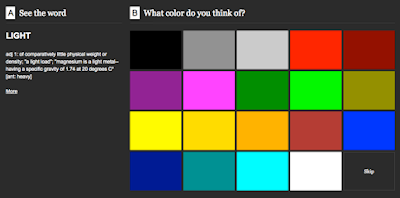
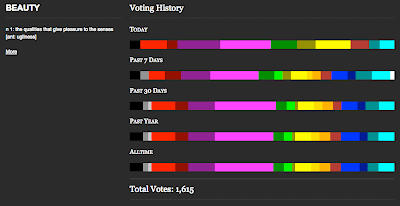
"Semantics can sometimes be a problem, because they don’t always accurately describe what we need to say. Conversely, emotions are difficult to convey in words. For a long time, there was a school of thought surrounding what was called “color emotion.” Now that term has changed because it’s been found to be inaccurate. cymbolism - beautyThe emotions that colors convey are not the same thing as semantics. The relationship between color and the psychological response of the person seeing it has been studied for a long time, though, and people are always trying to come up with new and better ways to describe what they see and what they feel. To that end, color-emotion exercises have been created that are designed to work with both semantics and emotion. These ask people to rate how they feel when they look at a particular color and give insight into what a lot of colors mean and how individuals can expect to feel when they are presented with certain colors, along with why that occurs. ...cymbolism - simple In short, color emotion deals with words like happiness, anxiety, and excitement, and color semantics is involved with term such as heavy, light, warm, cool, passive, and active. The distinction, though, is not always an easy one to make, and most people will say that color gives them a certain emotion because of the way it feels. This ties emotions and semantics together very tightly, and it looks like this will always be the way where color is concerned. For some people it has deep meaning and for others it simply provides comfort or a smile, but it generally always evokes some type of feeling."
This would make a great M.Sc. research paper on semiotics.

ciao
Bookmark and Share

Thursday, September 04, 2008

Form follows Gesture

Who comes up with words like "Wahrnehmbarkeit" ? That's why I admire the Germans. cypherone@taiwan's - abandoned UFO housesTheir language is so "genau" that when it's time for a philosophical/semantic discussion, there's little to argue about the meaning (Bedeutung), so it jumps to "the next level". It's just like the discourse of method, if you have small particles that are "genau" what they say they are, it's easier to discover their relationships, patterns, etc... compared to when you have "ungenaue" concepts on which you can't agree what they are or what they mean on the first place. In other words, if you use words like "whateva" or "embiggen"... (as seen on the menu of flickr slideshows) you're like doomed dewd... or you may as well be the reincarnation of Jebediah Sprongfeld!

All that came to my mind when I saw the BMW concept car "GINA" on BMW-web.tv . BMW's Gina - WinkIt's just extraordinary! You know I have a conflict with cars: as design objects, I must admit there are some beautiful pieces like Gina, and countless horrible cars like the mustang, hummer, aztec, pt cruiser, etc. Then, there's the argument that cars for personal use might be practical and convenient for the individual but unsustainable for society and the environment. Then, there's the issue of the death tolls... so much discussions about antrax scare, meningoccocal vaccination, high safety procedures on airports, anti-smoking laws... when more people die or get injured from car accidents each year!


Anyway, the whole "Oberflächigkeit" discourse takes a new level... or a "flat" level. in GINA. Interpreting surfaces as "skin" in such literal way, it creates an object that is more like a living organism. honda - facesTherefore, it is capable of mimicking human gestures, like winking. Maybe one day (if cars still exist in the future) we'll see cars that are smiling, angry looking, cursing at other cars, or just looking stupid not knowing where to go (I'm guessing that in that future, all cars will be GPS controlled, not human controlled). Then, cars could actually look like their owners or maybe they'll be some kind of avatars. Cool!

ciao
Bookmark and Share

Wednesday, September 03, 2008

Back to school

You know I'm not a great fan of autodesk, not even after winning a free t-shirt and a free seminar on one of their events. They dominated for a while as the (only) industry's standard, but they had to share that position with Alias, Rhinos or Solidworks. My opinion is that their dominance made them lose the innovative edge for a while, specially 10 to 5 years ago. A similar story happened with Windows vista: the expectations on innovations for new releases were so high, that many did not even acknowledge the changes, or were frustrated by old and/or new limitations. They also started to diversify into 10 or more specialized suites (just like windows went from 2 versions to 4) in an effort to meet the specific demands of several design fields like architecture, civil engineering, topology, industrial design, mechanical electrical plumbing, etc. instead of putting that effort into renewing the "main engine", they just gave away some aesthetic minor candies for those users. For me, the greatest disadvantage so far is that their apps are not cross-platform i.e. PC-Mac-Linux except for the ones they inherited from Alias.

When Autodesk bought Alias, reminded me when Bill Gates "bought" CompuGlobalHyperMegaNet... my concern was (and still is) that with fewer competitors, it would bring them back to the times when they ruled as "the standard" and they will soon again forget about innovation. There was a rumour of a soon to be released version of Alias studio tools for mac shortly before any news about the takeover. I predicted that if there was in fact a remote posibility of a Studiotools for macs, it got lost on that takeover. That lost hope was probably the worse loss... but (to my surprise) Autodesk has improved on innovation since the Alias takeover.


The AutodeskUniversity Annual User Conference and Exhibition wil take place on December 2 - 5, 2008 at The Venetian Resort Hotel, Las Vegas.
Autodesk University offers the world’s broadest curriculum of technical content designed specifically for Autodesk product users. Enroll early to make sure you get the classes and labs you want: Many offerings—nearly all of which are AU exclusives—fill up quickly. With more than 640 multi-level classes and labs organized in 20 discipline-specific tracks, you can easily customize your learning experience by choosing classes that are just right for you and your organization. Plus, class handouts and website downloads from AU Online make it easy to share the knowledge with your team. The AU 2008 curriculum offers 65 more classes than last year—and the number of hands-on labs has swelled to 80, a 20-percent increase from AU 2007.

The Industrial Design curriculum offers a full scope of classes covering software techniques, design methodology, and creative inspiration. We are interested in providing design insight for product engineers and strategies for interdisciplinary collaboration within product teams.
Some podcasts are freely available at the Autodesk University Blog (BLAUG).

ciao
Bookmark and Share

Tuesday, September 02, 2008

CATiq

The DECT Forum invites design students from all over the world to participate in the first international CAT-iq Design Competition and investigate in the future of broadband home communication.
This is an opportunity for design students from various disciplines to showcase their creativity and exciting ideas to an international jury of industry leading companies: The following experts will judge the submissions:
  • Vincent Buet (Director Consumer Marketing, Philips)
  • Pieter Hermans (Chairman of the Jury, CEO Jakajima).
  • Erich Kamperschroer (Chairman and President DECT Forum)
  • Nicholas Rhodes (Director of St. Martins College London)
  • Lesley Taylor (Head of Design, SGW Europe)
  • C.H. Tong (President, VTech)

More information about the jury at: www.catiqdesigncompetition.org/jury.html

The DECT Forum would like to encourage students’ creative thinking to conceive the future of home communication. There is almost no limit on the creative and innovative opportunities of the CAT-iq technology. The home communication industry is challenging participants in the competition in two basic areas:

  • Products – stylish non-computing hardware devices
  • Innovative and new services that can be offered by telecom network operators

“DECT Forum grants that inventors will stay owner of their own ideas. We will promote and market the best entries but will not claim intellectual property rights. This means that design students can not only win excellent cash prizes but additionally, the companies, who are sponsoring the competition will be interested to identify talented students for opportunities in their own organizations, says Erich Kamperschroer, Chairman of the DECT Forum.


For the winners of the CAT-iq Design Competition these prizes are available:

  • First prize: 10,000 €
  • Second prize: 5,000 €
  • Third runner-up prize: 1,000 €

The registration closes on September 19, 2008. The deadline for the submission of entries is October 10, 2008. Winners will be announced on November 14, 2008. Interested design students find all details and contacts at www.catiqdesigncompetition.org and www.cat-iq.org (via)

ciao

Bookmark and Share