Good apple, bad apple
Wow! I'm writing from my new mac 2.4GHz 2GB ram 500GB HD... and it's a beauty! The first thing I did was a test opening some of the files that were just too heavy for my iBook, a nd it's unbelievable fast! The "out of the box" advertising is absolutely true, just plug and start using the new mac right away. The keyboard looks like a toy, but when you think about it, you don't need a bulky thing and a bunch of useless keys. The only thing we are still not convinced is the glossy screen. Yes. it is very bright, but I prefer having a matte surface, specially since I have a window behind me. All in all, I absolutely love it! It was worth the wait until the release of OSX.5 I don't have it yet, but I'll get the upgrade in a couple of days for just 14 bucks!
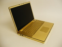
 If you are looking for something fancier, well... there's the LaCie golden hard drive or the golden hardtop for macBook pro by Computer Choppers (via) and there's also the golden iPod by xexoo... do not confuse with any Austin Powers archenemy! although, if you actually get one of those... is like actually wearing diamonds on the sole of your shoes.
(I'll update this post later.. it's time to play with my new toy)
Update:
 I just installed the new OSX 10.5 ... and it's great. Well... my problem is that some of the applications I had, are now obsolete and don't run on "devil inside macs"... and I don't like using some of the stylish gizmos like spaces, stacks or even the infamous dashboard, but unlike windows similar items, you can actually just turn them off and forget they exist if you don't like them. The finder now works how it should (it actually remembers your preferences!!!) I do not like that the menu bar on top of the desktop is somehow "translucid". Yes, it blends with the colour of your wall paper so it looks great IF you are not actually using the computer! If you have documents or applications open, it's horrible to have the menu bar in an un-matching "whiter shade of pale" So, what I did was to insert a grey rectangle on top of the image. My advise: use photoshop to do that, so you can re-size the rectangle until it fits and leave your wallpaper on psd format... just in case you need that rectangle later. Only when you shut down or relaunch finder you'll see the rectangle, which is better than having the menu bar like a rainbow all the time!
 I tried to install the infamous bootcamp... but I only have a licensed virtual PC 6, not a normal windows installation disc... so at the end, I couldn't try that out. Now it's too late because it only works with a non partitioned Hard Drive... and now mine is divided into OS, music, documents, and work volumes. It was not meant to be to have windows on my mac. I am still amazed how fast is my new toy, some apps open before I even let go of Ratatui (yes, that's the name of my mighty mouse). So, why would I actually want to go back to the evil
  empire? Yes, apple is getting a Bill Gates attitude, neglecting some thing for others... like postponing the launch of the new operating system to fix problems they had with iPhone! and Yes, they are neglecting the old "hardcore" Power PC users to get more "just fashionable" iPod users, but they are still delivering a product that still (somehow) does what it was all about in the first place: fast, stable, (almost) free of viruses and freezes, plug and play... and visually enjoyable. Even if the new operating is still full of bugs...
ciao
 nd it's unbelievable fast! The "out of the box" advertising is absolutely true, just plug and start using the new mac right away. The keyboard looks like a toy, but when you think about it, you don't need a bulky thing and a bunch of useless keys. The only thing we are still not convinced is the glossy screen. Yes. it is very bright, but I prefer having a matte surface, specially since I have a window behind me. All in all, I absolutely love it! It was worth the wait until the release of OSX.5 I don't have it yet, but I'll get the upgrade in a couple of days for just 14 bucks!
 If you are looking for something fancier, well... there's the LaCie golden hard drive or the golden hardtop for macBook pro by Computer Choppers (via) and there's also the golden iPod by xexoo... do not confuse with any Austin Powers archenemy! although, if you actually get one of those... is like actually wearing diamonds on the sole of your shoes.
(I'll update this post later.. it's time to play with my new toy)
Update:
 I just installed the new OSX 10.5 ... and it's great. Well... my problem is that some of the applications I had, are now obsolete and don't run on "devil inside macs"... and I don't like using some of the stylish gizmos like spaces, stacks or even the infamous dashboard, but unlike windows similar items, you can actually just turn them off and forget they exist if you don't like them. The finder now works how it should (it actually remembers your preferences!!!) I do not like that the menu bar on top of the desktop is somehow "translucid". Yes, it blends with the colour of your wall paper so it looks great IF you are not actually using the computer! If you have documents or applications open, it's horrible to have the menu bar in an un-matching "whiter shade of pale" So, what I did was to insert a grey rectangle on top of the image. My advise: use photoshop to do that, so you can re-size the rectangle until it fits and leave your wallpaper on psd format... just in case you need that rectangle later. Only when you shut down or relaunch finder you'll see the rectangle, which is better than having the menu bar like a rainbow all the time!
 I tried to install the infamous bootcamp... but I only have a licensed virtual PC 6, not a normal windows installation disc... so at the end, I couldn't try that out. Now it's too late because it only works with a non partitioned Hard Drive... and now mine is divided into OS, music, documents, and work volumes. It was not meant to be to have windows on my mac. I am still amazed how fast is my new toy, some apps open before I even let go of Ratatui (yes, that's the name of my mighty mouse). So, why would I actually want to go back to the evil
  empire? Yes, apple is getting a Bill Gates attitude, neglecting some thing for others... like postponing the launch of the new operating system to fix problems they had with iPhone! and Yes, they are neglecting the old "hardcore" Power PC users to get more "just fashionable" iPod users, but they are still delivering a product that still (somehow) does what it was all about in the first place: fast, stable, (almost) free of viruses and freezes, plug and play... and visually enjoyable. Even if the new operating is still full of bugs...
ciao


2 Comments:
Congrats on your new mac!
It was about time too ^_^
Thanks!
Yes, it was about time...!
However, I'm still using the old laptop to run photoshop elements, because your friends at adobe decided not to support any old applications on leopard except cs3.
Thanks a lot adobe!
ciao
Post a Comment
<< Home